Experimenting with textures.
For this first task we were asked to gather a bunch of objects with interesting textures and then draw elements of that object to show off their textures. With this exercise I decided to pick 4 objects and recreate those textures in a range of different materials.
Below is a picture of the result: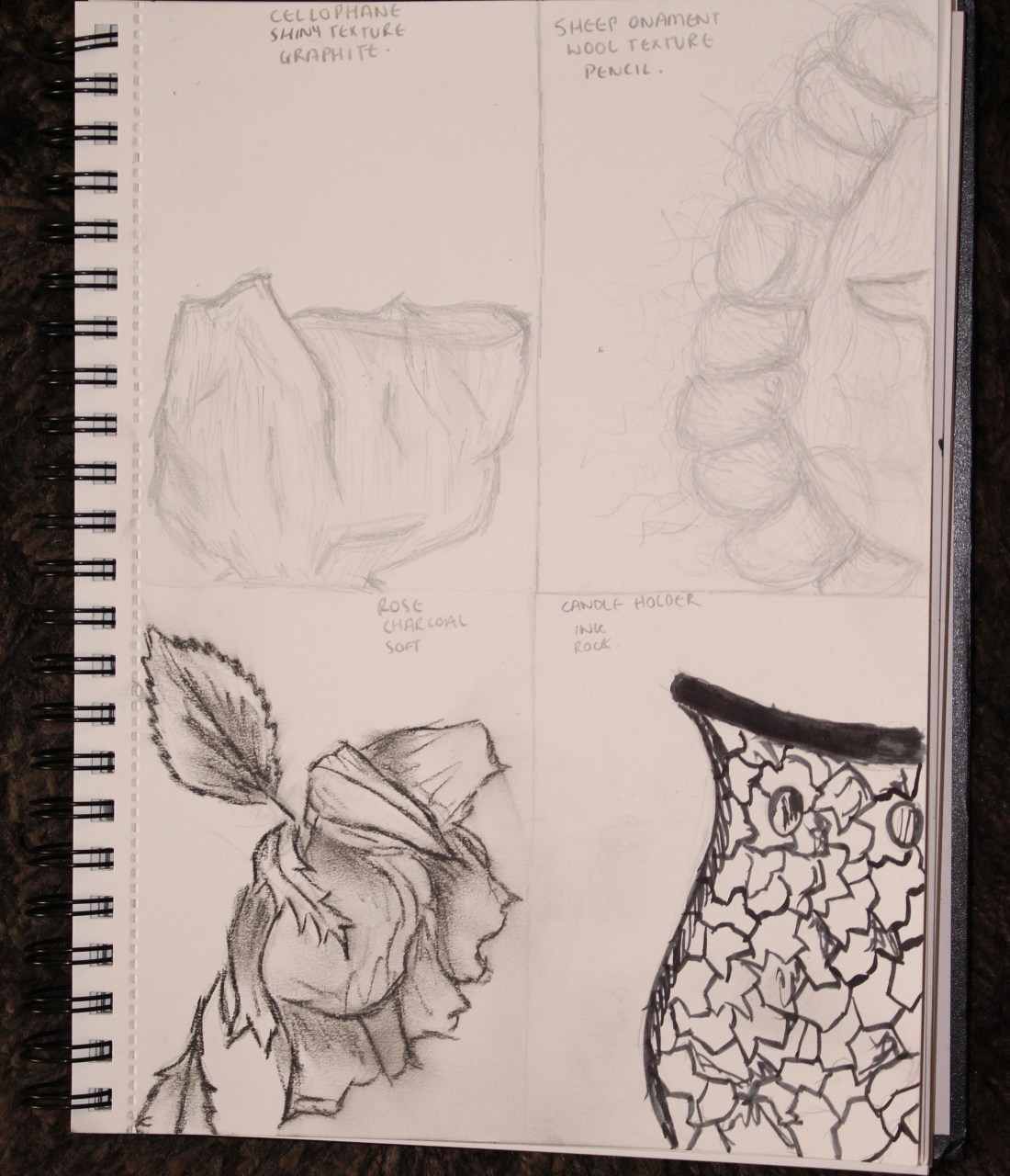
For these drawings I used the materials of : graphite, 2B pencil, compressed charcoal and ink using a paintbrush.
Section 1- Cellophane wrapper.
The first section I did was a close up on a candle I was gifted which was wrapped in cellophane, I chose to use this texture because I thought it was interesting in the sense of its crunch when you feel it and the harsh crinkles it has when wrapped.
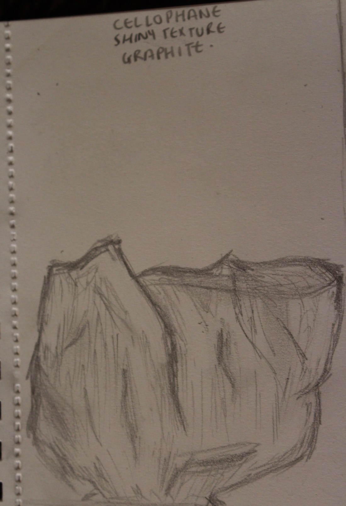
I decided to use graphite to produce this piece due to it being easy to glide and make various quick marks with, with graphite I was easily able to erase any lines away which I wanted to do to give the transparent look and shine that the cellophane has. I think using the graphite and the smudges and tone does create the right texture look I was going for and I’m happy with how this image turned out, it gives an overview of how the texture was crinkled as well as looking transparent.
Section 2- Wool ornament.
In the second section I did as it was an interesting texture to recreated, I wanted to use this because it was a different texture to draw, the texture was soft yet firm in the way it was placed and interesting to see every piece of hair which created the wool.
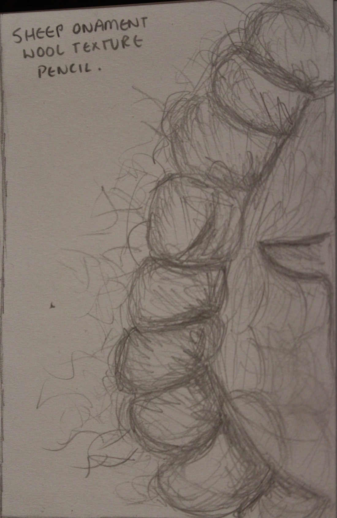
I drew this piece by using a 2B pencil, I found this was the best material for me to use due to it being a soft texture to draw and to be able to get the real effect of the wool, it was an interesting thing to draw as the texture isn’t something I’m used to drawing yet I don’t dislike the outcome, I think it gives an accurate sight of the texture. I wanted to add tone in places where the light wasn’t hitting therefore I pressed harder on the insides of the wool which is where the ornament pieces met. All in all I’m happy with the effect this piece gives and I found the texture interesting to represent.
Section 3- Rose.
The third section I wanted to use compressed charcoal to get a different material to work with and I wanted to get a different material that I could smudge with, I thought the rose would be a good object to use seen as you do get some nice softness with the petals and it was an interesting texture to recreate.
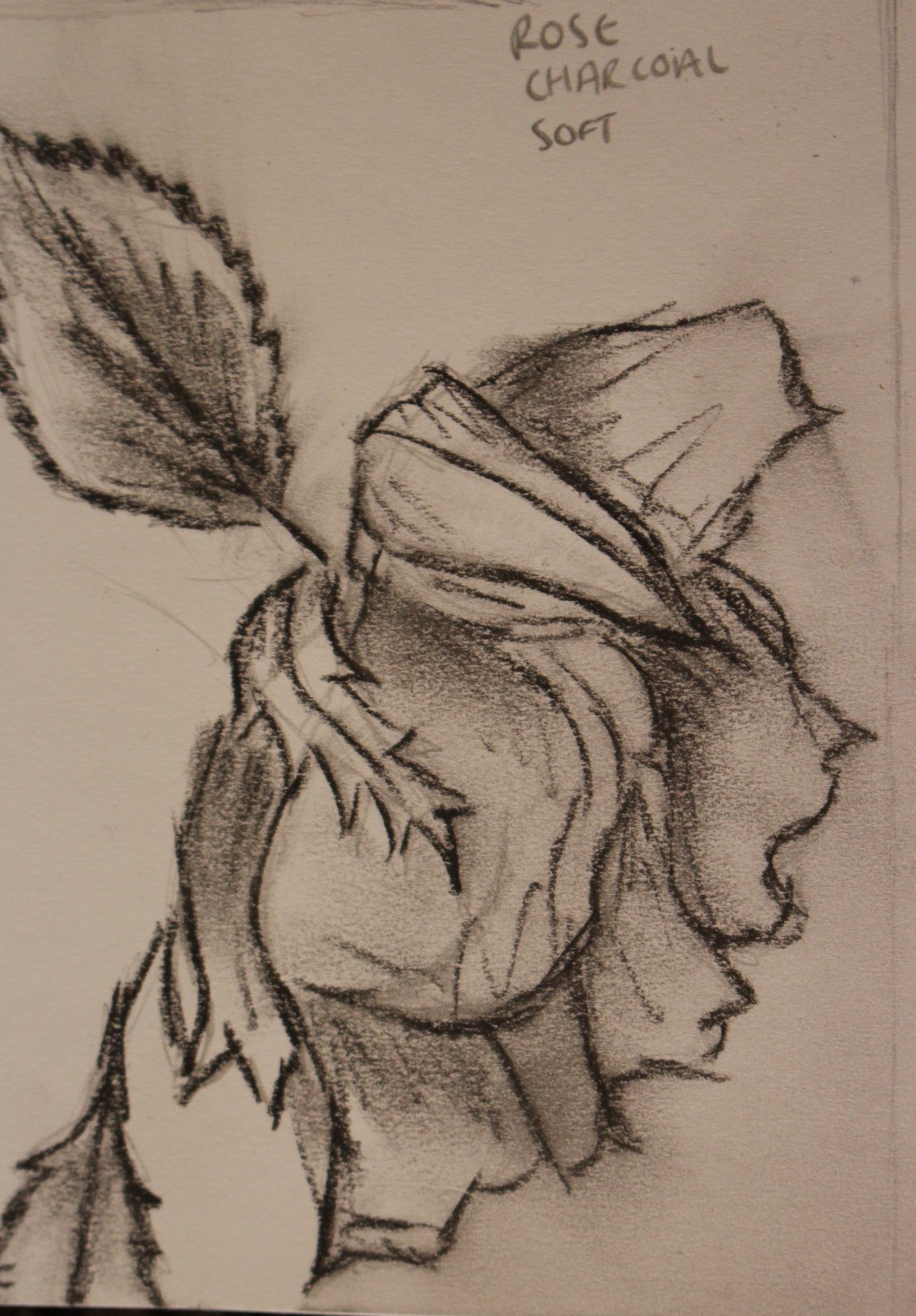
In this piece I used compressed charcoal, I used this texture for the rose as I wanted to smudge this piece to get toning in for where the light was hitting onto it, I liked using this media as I think it did give a good look at the texture of the rose and can show the crisp edges of the petals. I liked how this turned out I think it’s a good representation of the rose, I do like how the sharp likes show the texture of the edges yet the smudges show the real softness of the petals.
Section 4- Candle mosaic holder.
I decided to use this object as I thought the textures of the mosaic was interesting and the ways they joined together different, I wanted to show the sharpness of the texture and the elegance of the pattern.
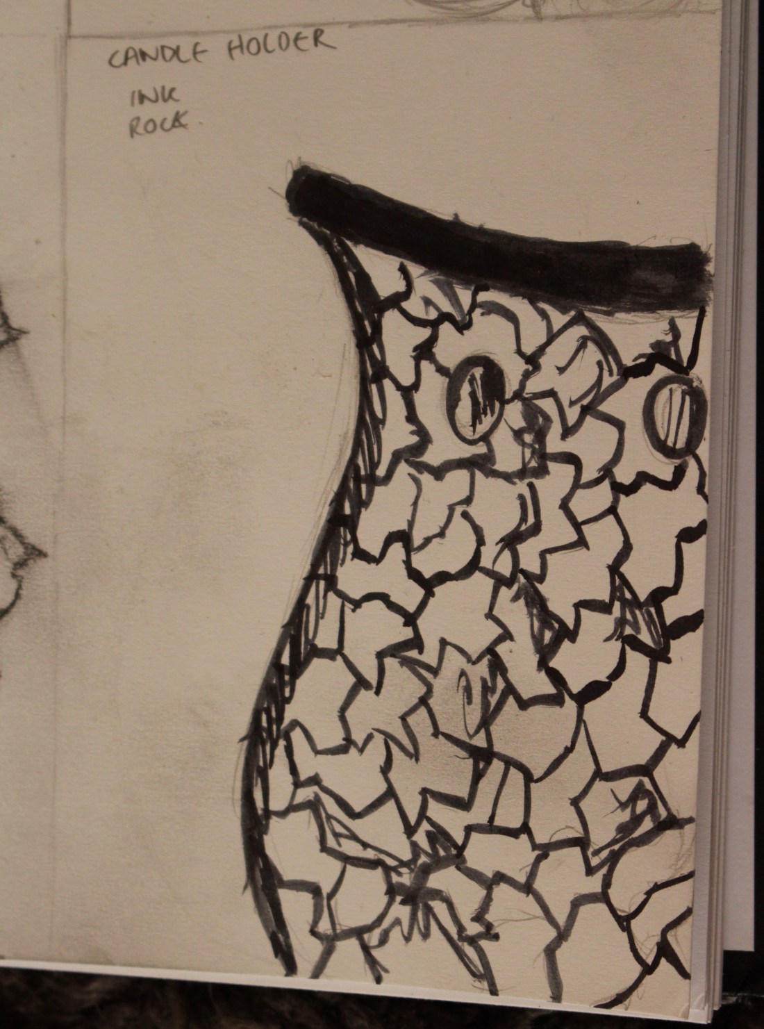
For this last piece I decided to use ink as I found it would show the sharpness of the edges on the mosaic and also have a more accurate media for this object. The texture does show on this piece yet I’m not too please with the toning and I think I perhaps would’ve been better using the pencil for this object to really show the detail of this piece or maybe using a slighter paint brush. I do think you can tell what I was trying to create and the slabs of pot do show yet it wasn’t as effective as I would have hoped, I did try my best to get some tones in there yet it isn’t as detailed as I’d wanted.
Frottage experiments.
For the second part of this exercise we had to create frottage therefore I ripped out a page of my sketch book so I didn’t get all of my pages dirty! Then I went out and inside my house to find fascinating textures, I found myself finding all sorts of things but some didn’t turn out a well as I’d hoped and others really turned out well and the textures really came through. 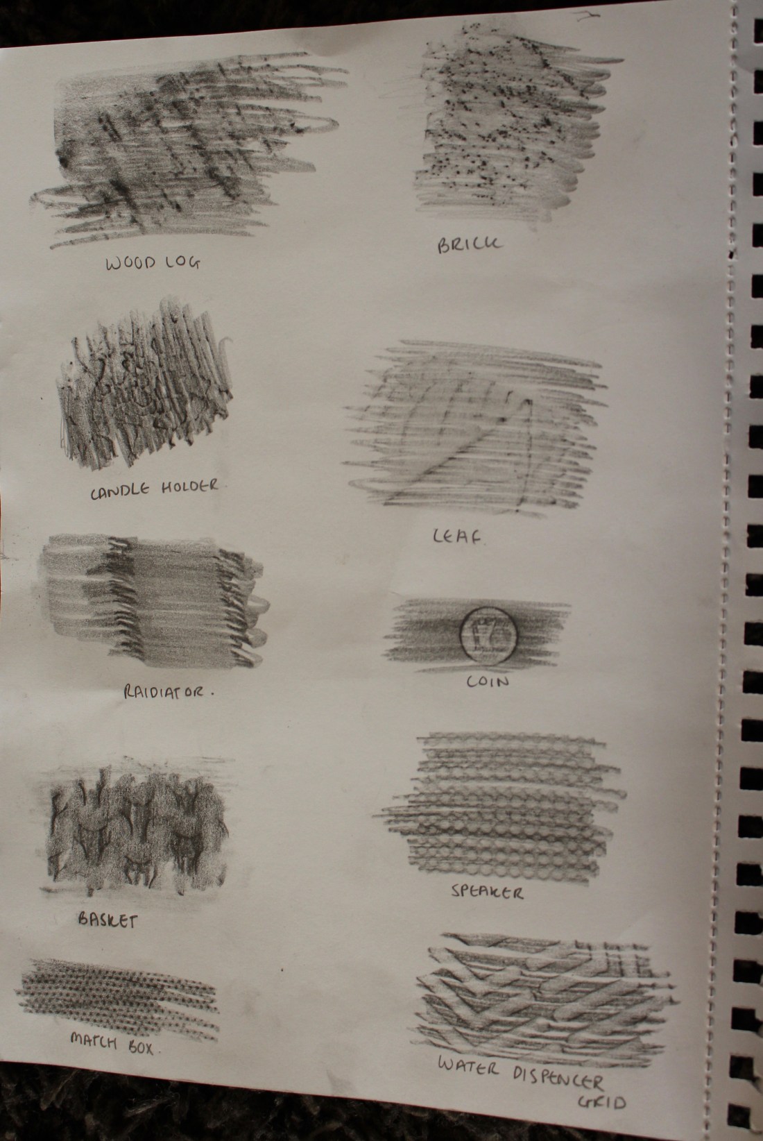 I decided to do the markings using graphite as I thought it would have a better outcome when resulting to showing the different textures. I was pleased with how most of them turned out and it was an interesting way to see different textures and the results of their markings, the log wasn’t as successful as I had’ve hoped yet it still shows a little of how the texture looks. The leaf was a difficult one to get markings from although you can faintly see the outline, non of the markings were a complete fail and didn’t work so I was overall pleased.