For this exercise we were asked to pick three colours and focus on the different layers you can create building up your colour to add tones. To find an interesting sight of the building to focus on and look into colouring that piece of art. I decided because of COVID-19 again to use an old image taken from Spain, I thought the three colours I should use were Grey, Brown and a peach colour to get the same tones on the building as the picture. I wanted to create a realistic photo but again I haven’t really invested in some good colouring pencils for artwork therefore I couldn’t get the exact shading and tones I would’ve wanted.
Below is a picture of my result:
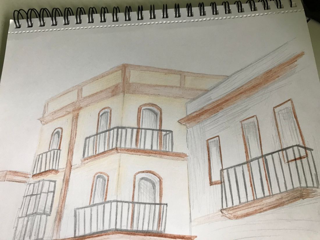
I do think the angles on this picture are represented well and you can tell the effect I wanted to create, I do think that if I had some better preforming pencils I could’ve created a better final piece yet I am working with what I have for the moment, I will invest in some in the near future. I do like the shading I got to show the point of the building and it does create an effective look on the buildings, I do like how I have improved in creating accurate pieces on the angles and showing buildings off differently than I am used to, I have never been interest in drawing architecture but I do think I have done well in showing my skill on doing so with these pieces.
All in all I do like this piece but I would like to invest in some more premium coloured pencils to be able to create more detailed tones with colour. I wanted to show this off in this piece but it was difficult with these pencils. however I am happy with how the angles and representation of the buildings have come across and I do plan to keep developing my my skill in architecture in my spare time. With the limited colours we were chose to use in this piece I did find it more difficult to get across the tones yet I do think I did well considering the limitation of that, therefore I do think it was difficult yet I managed with the limited resources.
