Mattew Stone
Mattew Stone is a London based artist which graduated from CamberWell College of Arts, London and he is currently stages performances and films. His work is widely known and I have discovered it by seeing his underlying structure art of a face. I was fascinated by his use of colours and the different ways he was showing the underlying of the skin in his work. Below is the picture of his work:
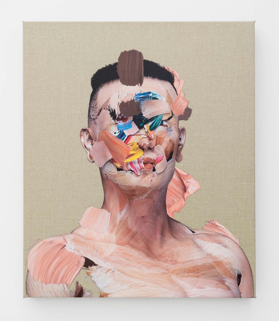
I picked this one out because I thought it was interesting how the paint was layered up in different ways to create the effect of the structure behind the skin. I think it is an interesting way of expressing this theme and showing contrast and cases of colours in the work. The different brush marks call for an interesting piece and I was really drawn to this. It is such a different way of expressing this theme rather than older work, it’s a lot more modern and shows such an abstract piece of work.
I love the way this artist has mixed the colours like that and managed to get the lighter tones in with the skin tones, the blend between the structure paint is really interesting, it doesn’t look bizarre it all just blends and works together well. I do think this is interesting and has really opened my eyes in my own work and trying to develop my self into thinking outside of the box.
Leonardo Da Vinci
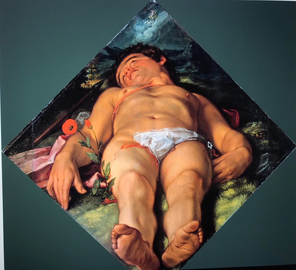
Leornardo Da Vinci was an Italian painter also considered one of the greatest painters of all time. The Mono Lisa is the most famous of all his work and the most famous portrait in the world. His work isn’t just that he has various different pieces showing underlying structure which is what I have found whilst doing this research, below is the picture I have chosen to look at in more detail:
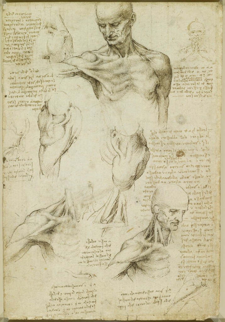
This piece is good for comparison from the first, you can see how the movement in art has changed. This piece is more more a factual piece of work and shows the in-depth of muscles and the full descriptive look at the scripture of the body rather than an abstract colourful approach from Mattew Stone, I find this piece much more interesting as it’s a realism drawing of the human diagram.
I think as years have gone on people have got more of an imagination when it comes to using bold colours or thinking more interestingly about showing art. The bold colours are completely different to this realistic sketch of the body yet they both impact on the theme. I find it interesting how time has evolved and how different artists think to represent things in different ways.
All in all I found this research interesting, like all of these comparisons it’s sure to see how much artists imaginations have changed throughout history and how much more adventurous they are with showing off different things in more abstract ways. In both pieces it has made me want to look into different styles of work and to experiment myself in ways I can create more interesting pieces.