Review of Project two.

Review of project two.


For these two exercises I found the materials I used were both successful and I was happy with how well I was able to adapt to using them and learn quickly how to show tone. The one thing I would say was a bit more unsuccessful was figuring out how to place and show the objects and to also get a lighting onto them which showed the different tones and shadows onto them to create an interesting piece.

I think with these piece I did manage to get a good sense of depth and really work at getting an accurate representation of the objects, trying my best to get an accurate scale at the same time. For getting this so accurate I found an aspect that helped was to see the background and to see clearly how it was set out.

I found being restricted to just using lines and tone interesting, seen as I normally have more freedom when drawing I found it different experimenting with new techniques and being restricted to one style. It was a bit more difficult doing things straight from using a non erasable material was difficult because I normally like to map out my drawings before I go fully in with a permanent material.

I found I worked a little differently using colour in my drawings because I couldn’t erase anything out after drawing it, I also found it was different to blend in the colours into each other and it was a different technique to show tone into the drawing but all in all I found it a good exercise to get used to using colours within my work.

Still life in tone using colour

Still life in tone using colour.

For this exercise we were asked to draw out objects using a coloured material and then change colours every time the tone on the objects changed. We were told it could take us more than one attempt to get a piece we’re pleased with.

For this piece I chose to line up two containers and draw those out, I decided the best media for me to use was coloured pencils and I did this exercise in 2 pieces using two different colour methods and one I liked better than the other. Below is the pictures of my results:

IMG_6938 2.jpeg


IMG_6937 2.jpeg


I found this exercise interesting to do, I have never used coloured pencils to do tonal work like this before and I found it quite an interesting way of showing tone. I wanted to stick to the same colours but in a different shade or tone therefore it wouldn’t look as messy as using completely different colours. I found I preferred how the first attempt I did turned out, the reds seemed to blend well together and created quite a tonal representation of the objects I was trying to recreate.

For this exercise I used a different style of technique when showing the different tones as well as doing some detail using cross hatching. I found the way I have used the coloured pencils has made the drawing look quite realistic and an accurate presentation of what my view of the objects was.

All in all I am happy with how both of there pieces have turned out although I was more impressed with my first piece due to the colours having more blend-able features and really showing the shadows and tones change throughout the objects. I haven’t really experimented with using colours for using tones before so I found it fun to use this media in my work and I will practice tones with colours more in my spare time.


Still Life Using Lines.

In this exercise we were asked to gather a bunch of objects that some how connected, in either similar heights, weights or had a connection naturally. After we’ve gathered and placed the objects we were asked to draw them from any angle and view point we wanted and to do this piece of work using some type of ink based tool.

For this piece I wanted to use a display of kitchen items as I found they connect in a natural way and it would give life to my drawing as it’s a daily appearance in our lives. After I got the set up I decided to use a ball pen as it’s easy to use and creates good tonal work. Below is a picture of the result:

IMG_6931 2.jpeg


In this piece I found it was a nice exercise to do, I liked using the ball pen to show the tones and textures throughout the piece, I found it was a really effective and different way of drawing an image out. I am happy with the composition of this piece and I’m happy with the angle and the way I’ve set out the objects.

In this piece I decided to go with a lot of the cross hatching technique to show the tones during this drawing, I found with using the ball pen it was the best way to show the dark tones, it was easy to make quick and fast lines to really show the detail and tones within the objects.

All in all, I am happy with the result of this piece and I think it’s really effective in the way of the tonal work and the different techniques I have used throughout the drawing. I am really pleased with how the drawing has turned out and I will further this technique throughout my artwork because it has been an effective way of showing tone and different texture throughout my drawing.

Detail and Tone.

Detail and Tone.

In this exercise we were asked to draw an object either something like a shell or some draft wood (something with textures) we had to use various different tone work and use techniques such as shading, cross hatching and using an eraser to enhance the light tones of the object.

I found this exercise enjoyable to really go to town on making the object I chose look 3D and use multiple methods to enhance the dark and lighter tones, I decided to go with a shell seen as I found it was the most interesting to get different textures and lighting onto the object. Below is a picture of my result:

IMG_6927 2.jpeg

As shown on the picture I used a lot of cross hatching to really pop out the darker tones on the shell and I used the eraser occasionally to show the light tones on the shell. I enjoyed using the cross hatching to show the dark tones and using that technique throughout this piece I found worked out and was quite effective, I also thought enhancing the lighter tones with the use of an eraser was an effective use and I’ve learnt a lot about how you can show tone through using a pencil.


All in all I am happy with the result of this piece and I think the techniques I have used turned out to make the tones look effective throughout this piece. I have learnt a lot about different ways to preform toning and how to create different ways of using and showing tones that I will take on board and use throughout my work.


Review of part one:

For this piece I found the best technique for this exercise was the cross hatching- I found this the most effective due to it showing the darkest tones and being buildable to really make some effective tonal work.

IMG_6962.jpeg

IMG_6963.jpeg

Research- Negative and Positive space.

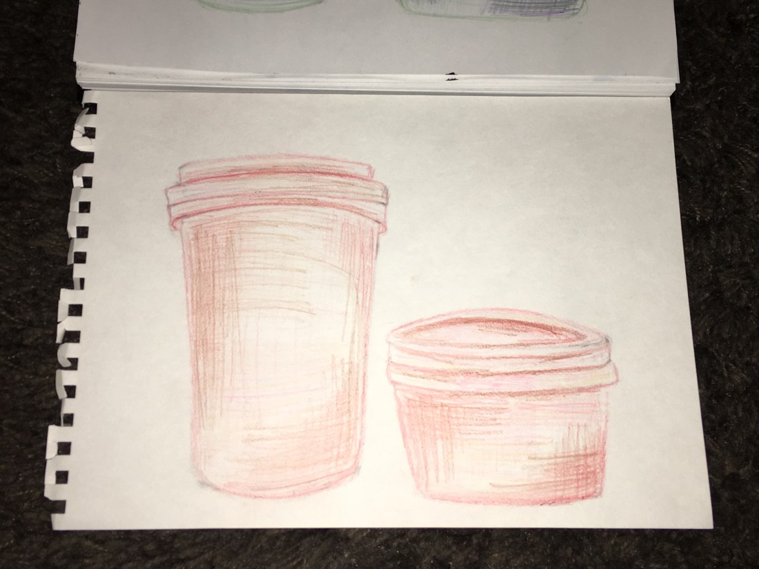
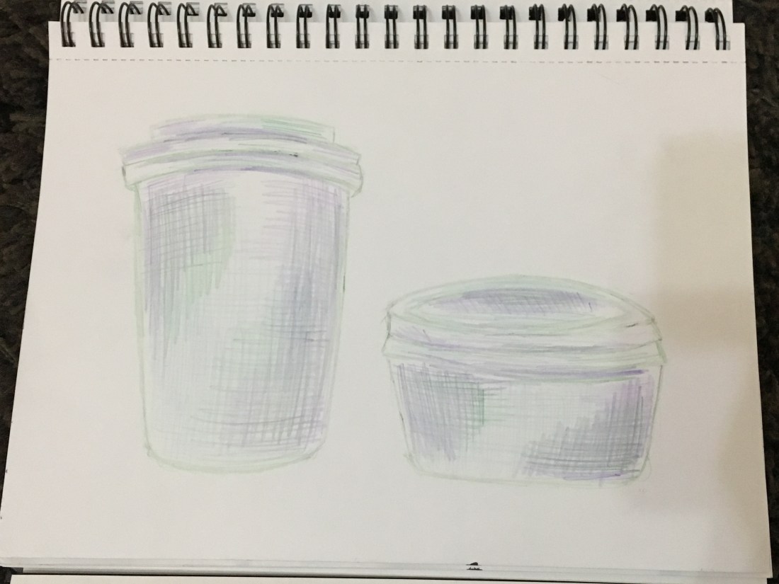
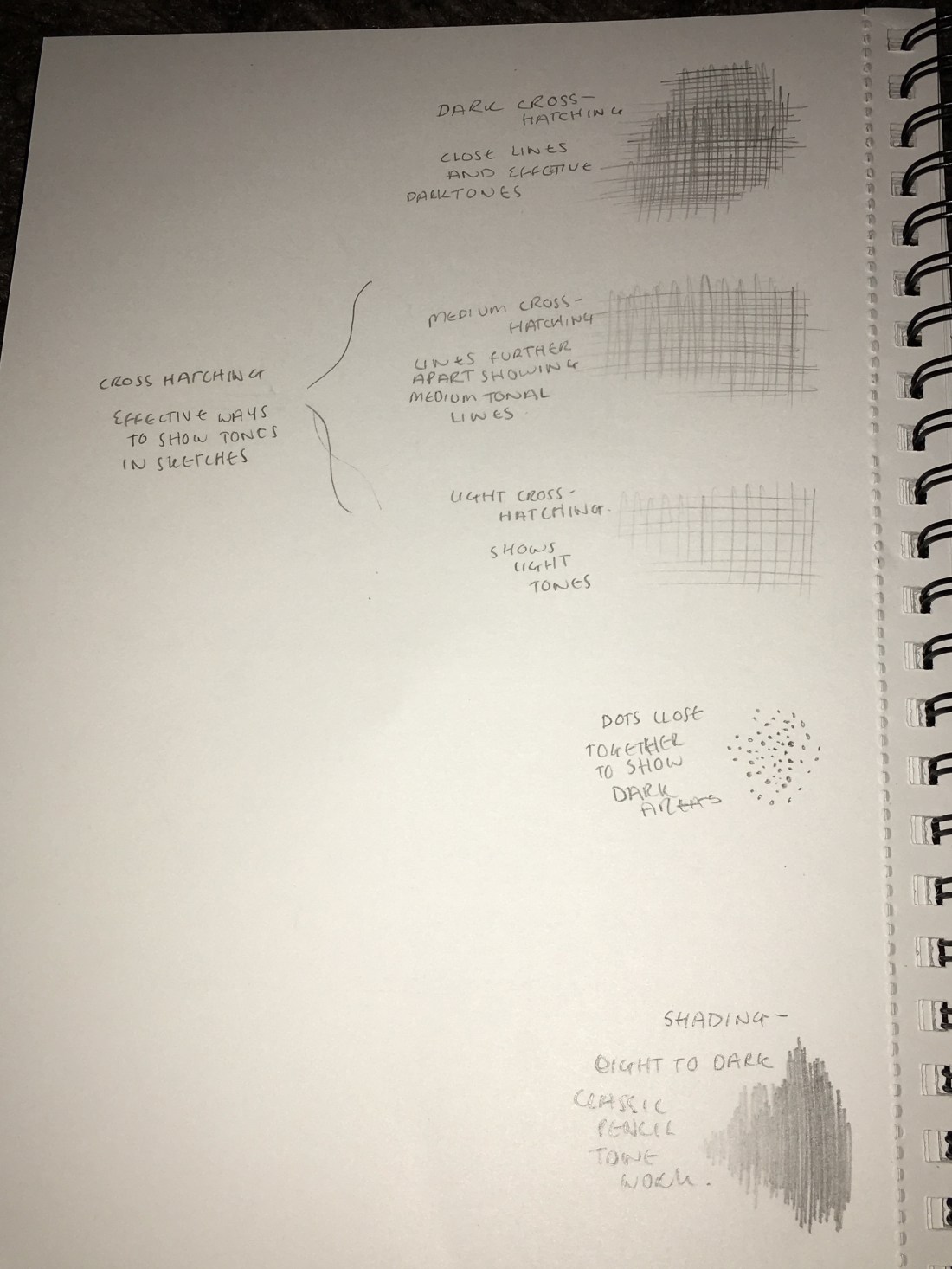
Negative and positive space.

For this task I have looked into negative and positive space, for this I have looked into a range of different artists to get a feel for how affective this technique of work can be. I wanted to see how different artists from around different era’s have used this technique within their work and to see how it stands out from different work.

James Abbott McNeill Whistler.BN-JE194_0703WH_M_20150630142403.jpg

This piece of work was significant in it’s time of release in 1871, this piece was different in this era due to the angle of his mother, back in this century it was known for portraits to be taken at a face on angle so the model was towards to painter, this work was not common in the 1800’s as his mother is sat to the side when being painted. This image shows the real impact of negative space due to the painting on the wall of the woman, this gives a sense of reality to the painting and shows you the life of what’s going on outside of the painting, the fact that it makes the viewer not just focus on the mother but also the rest of the picture, this shows how clever using negative space can be.

Rene Magritte.

My next artist I found interesting, the work is different and unique, his way of making art is to change the way we look into things and stretch the viewers beyond reality. His work amazed me as I looked more into it and how he changes perspective when you view his work.

Decalcomania 1966. Mysterious paintings by Rene Magritte

This image uses the negative space to represent the outline of the man, this image lets the viewer look in two sides of the image but see the same thing. The image is clever in the respect it has two sides of the image and the view focus’ of both sides. The artist uses the negative space of the image to show a different painting and to use it to let the viewer have two main things to focus on.

Patrick Caulfield. 

This artist I researched is more contemporary and use’s negative space in a way to enhance the image, he use’s the background as the main image. His work is bold, as I looked into his work I found it different to the other artists I have researched in the fact his work is more cartoon effect and he uses his negative space in different perspectives.

This image stood out to be as the artist has twisted the allusion in the main focus of the image being the background, the negative space has been made to be the full image, his work stands out in the fact the colours he uses for his backgrounds. The glasses stood on the shelf have been focused but the background is the full image. It shows how clever negative space can be, in the respect that it can change the full dynamic of the artwork and can create such different allusions.

Image result for patrick caulfield

This image by the same artist creates the same allusion but relates to the first artist I research in the fact he has used the full image as his space, the negative space has been used to connect to the viewer and there is not full part of this image to focus on and that’s what is clever about this artists work. They use the full canvas and don’t just use one part to focus on.

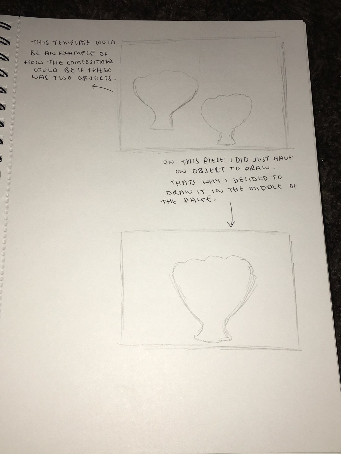
For this task I have discussed the meaning of negative and positive space and how it really can make a difference on how the art is shown. I think I have learnt how the negative space can be used in different ways and got inspiration from other artists who have used different ways for this technique. I have found this task beneficial in the fact I can see how different art can be made through negative space, it has shown me how I can change the way I work with composition in my work.

Research on still life.

– Research on still life.

Historical still life.

For this research point we need to research into traditional approaches to still life and get an idea of the genre we’re entering to learn more about it. For this I did some research first looking into the more traditional and historical artists and how they took approaches onto still life.

Firstly I came across an artist called Evaristo Baschenis with his piece of work called ‘Still-life with Musical Instruments and a Statuette’ this was done with oil on canvas in 1660. This piece was done with dull lighting and a realistic take on the image in front of the artist. Seeing this artist has shown me that in the 1600’s the representation of still life was realistic and shown exactly how shown when viewing.

In the image above you can see the accurate representation of the lighting, it shows the tone and colours changing matching the lighting entering the image. Seeing this artist’s work and looking into various different types of work in these era’s, I found that historical artists did more realistic representations of the layout ahead of them, the work they did was accurate in the lighting and the toning on the objects. The colours used are more dark toned and the lighting is done which is a common feature of still life in this century for it to be dark with little lighting.


I then came across an artist called Paul Cézanne, the piece I came across was called Still-life with Bowl of Fruit done with oil pastels on canvas this piece was done in 1893. This piece of work shows off how it was shown back in the 1800’s for still life and how the representation of the style was.

As shown in the image above the still life form was more traditional as in it was done to accuracy and done as a realistic representation of the image the artist would see. The imagery is bright and coloured with more primary colours than the previous artist I came across in the 1600’s, the work seems less realistic but still has the accurate toning and contrast on the objects. The lighting in this picture is more bright and the full image has more lighting than the previous, the toning and dark tones are only in the areas of shadows.

Contemporary still-life.

Finding a more contemporary famous still life artist was more complicated therefore I went on google and did my research throughout that platform, when doing this research I found that all types of contemporary art were so much different to the past centuries, modern still life art is more bright and different, artists have had a new way of seeing this type of art and changing it’s view, it doesn’t have to be an accurate representation of what you see it can be formed into whatever you imagine. Different media’s are used and new technique’s. Early Morning Tea ~ Contemporary Still Life by Laurie Justus Pace by Laurie Justus Pace

With this image by Laurie Justus Pace called ‘Early Morning Tea’ it shows the brightness and different techniques contemporary artists use and get inspired by. For this piece of art I found it fun and it still represented the items the artist was looking at when creating this art. I think that the techniques in her use of the brush really show the different style to the previous decades.

The materials we use today on our art are different, the way we express are is more imaginative and we use colour to light up an image and show an object for a different way than it really is, in the 1600’s they would express art through realistic form and create art to look real. But as decades went on we now explore art in different ways, the colours we use, the lighting we use the techniques within our materials are new. We show things for what they are but use different ways to express our sights. We use different materials and use them in different techniques to create expression, the composition hasn’t changed much, we still line objects up and create different ways to place them yet we change the way we represent things.