Exercise 2- Foreground, middle ground, background.

For this exercise we were asked to look at a landscape and focus’ on the different parts of the picture. In this piece I decided to use a picture I took when I was visiting wales last year that I took over a river. I wanted to use this as I focused the main part on a close up of a branch of leaves. I thought this piece would be interesting to do with water colours and try to show different markings for the tones and textures through techniques using my paint brush.

Below is a picture of my finalised piece, I do think I like the colours I used and the different colours I have shown in the leaves on the branch. I think that I am exploring more with techniques and I did well on this piece considering I’m not used to working on a larger scale with my artwork.

IMG_6466 In this piece I tried to make markings to show the different softness of the trees, I dapped my brush and tried to create the different markings I have been seeing throughout artists in my research. I like the way it looks so thought it would be a great day to show the softness of the leaves across the canopies. I wanted to show the different colours in the leaves of the nearest tree I was focusing on, I liked to show this because it was the foreground of the picture, the different lighting was dark throughout the leaves. I used a subtle bit of colour in the river to show the reflection and rocky bottom of the water, as well as showing the reflection of the grass across the side of the river. I used different colours throughout the trees to show different markings and the tones of lighting on the bark I thought this created an effect of realism to the piece.

All in all I do like this piece, I think I have shown good mark making throughout this piece and shown well the foreground, middle ground and background. I am happy with the different elements I have made and do think my water colours is improving. I like the tones I have created in the leaves and the softness of the tree canopy. If I was to improve this piece I would look more into spending more time on the tree leaves, I think if I had spent more time on the colours I could have made the leaves more clear and had a more vibrant colour for them. I do think for a big piece I did well on this because I’m not used to doing pieces of work on a big scale. I do want to continue working on my skill of water colours but I do like how this piece has turned out.

Research Point- Contemporary to Classic.

In this research point we were asked to find contemporary landscape artists and earlier artists and compare the two types of work. There were two artists suggested we look into and compare works which were Tacita Dean and George Seurat these two artists have completely different ways of working and I found it interesting selecting two pieces of work to look closer into.

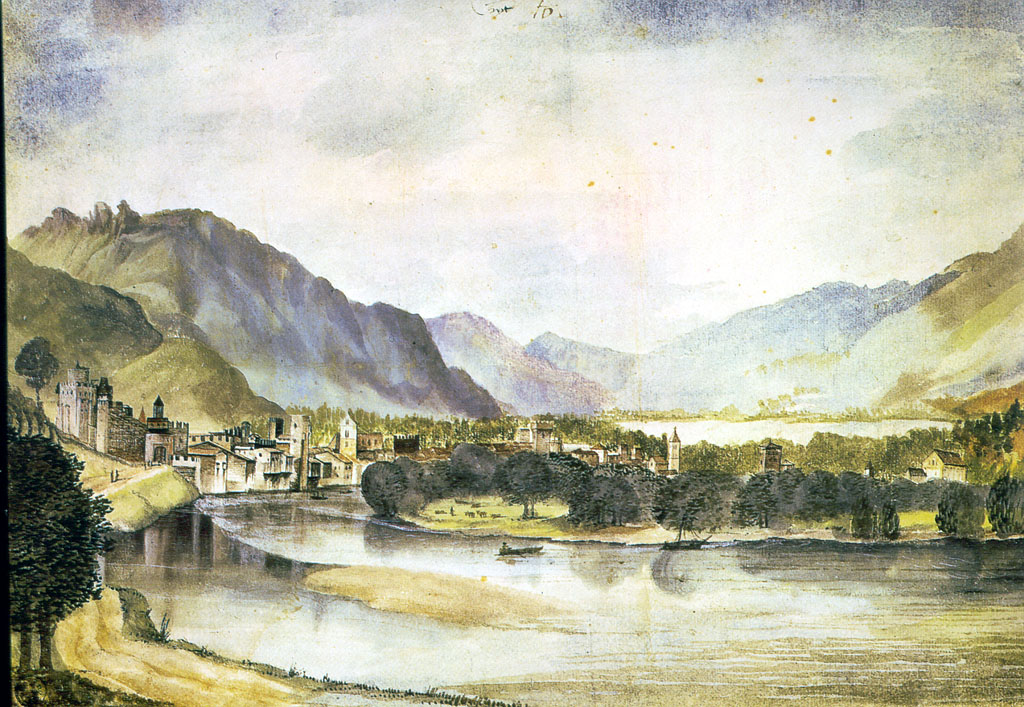
Below is a piece of work from artist George Seurat, his work is very colourful and he uses a lot of techniques throughout his painting to show different texture and uses a unique style to show his effect of the landscape, his mark makings are like sponge dabbing it creates an interesting look and I enjoyed looking through the different pieces.

99e6f452592253a7c225d07958aa12d9

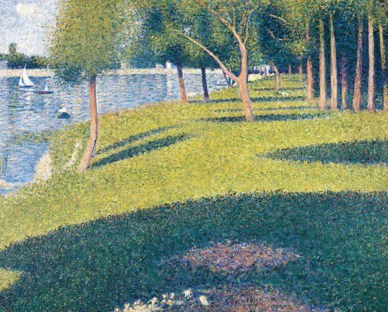
His work is very different and has a soft approach the the eye, it’s detailed and the way he shows his tones and shadows throughout the piece is very interesting. I like the mark makings and the sharpness look he puts across the water to show the reflection across. This piece is interesting and has made me see more ways to express landscapes and styles of work.

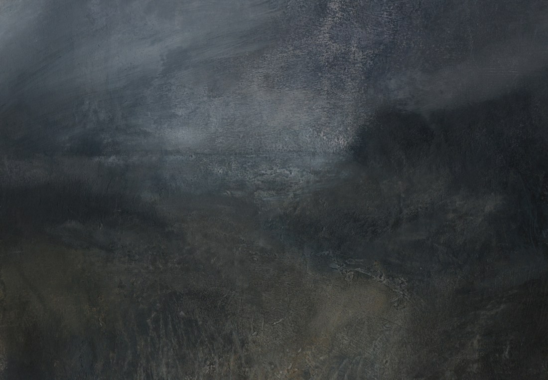
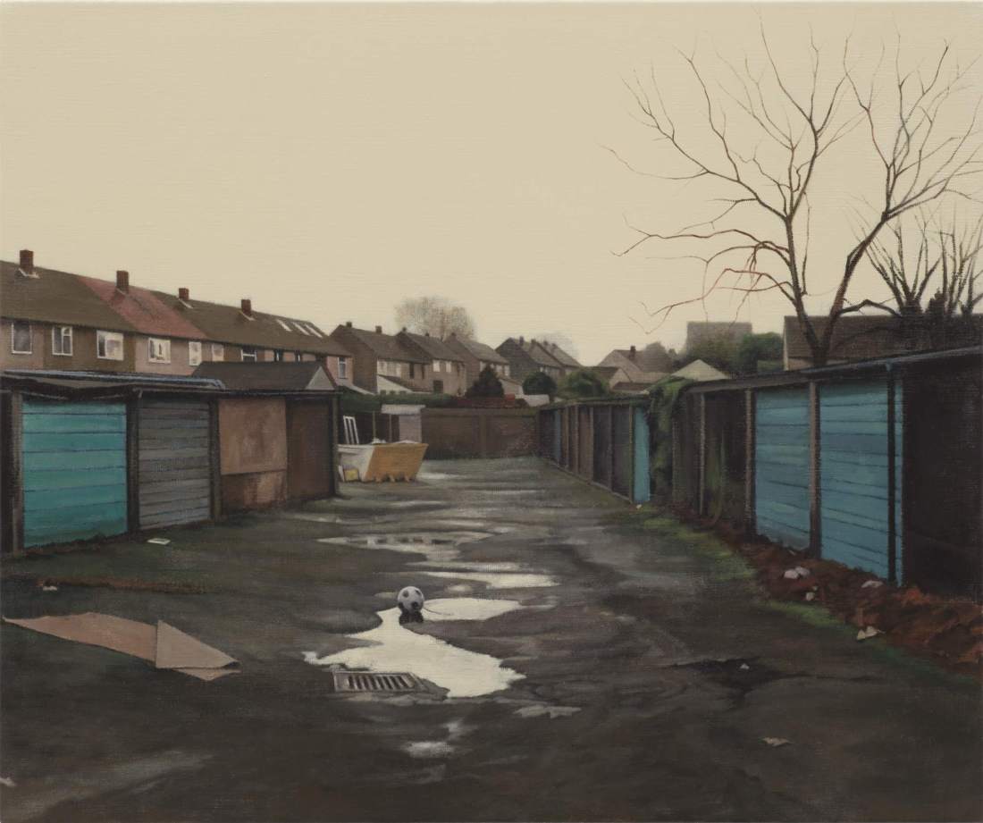
The next artist is Tacita Dean, her work is monochrome and shows a completely different style to George Seurat yet her work is unique and has so much depth to the image. Her work shows great texture and detail, I like the ways shes blended in the tones and made it looks so realistic.cw-26904-660x375

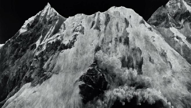
In this work she shows depth within it her piece, she uses different mark makings to show the detail within the rocky mountains. I like the style of work and I think the monochrome creates a lovely atmosphere and effect for the full landscape. The style is realistic and shows the tones throughout the mountains, it’s a clever way to show the texture and considering the full piece is black and white it’s clever to have shown the different shadows throughout.

The two artists are very different, one artist is colourful and shows the colour and texture in a unrealistic type of way yet demonstrates realism, he has a clever way of showing marks using dabbing techniques throughout the whole piece, they both have similarities in the techniques they show for different lighting throughout the landscapes. I think as the the times have gone on the art has become more adventurous and more artists are experiment within their work. The contemporary artist has used more harsh lighting and shows more sharp mark making whereas the earlier artist demonstrates softness and the lightness of his work is more calming for the piece. In these two piece I have chosen the earlier artist focus’ on a full scenery and landscape the view point is very different to the contemporary artist as she has just chosen to look at one point of a full scene and really look at the detail within that mountain range focusing more of the textures throughout two main observations rather than a full scene.

All in all, both artists have similarities  in their focus’ to mark making and using different techniques throughout, they both focus on showing the lighting and the shadows in all the elements of their piece. The earlier artist use’s more vibrant colours throughout and has a different style of landscape, they decided to look a full scene and focus on towns and country scenes. Whereas the contemporary artist has a different point of view and looks at close up detail on mountain ranges showing more harsh markings and monochrome art. Both artists are very clever within their pieces and show great techniques in different ways but have different view points and angles in their work.


COMPARISON NUMBER TWO.

Wolf Kahn.

Wolf Kahn is a famous born German, American contemporary painter. He was known for his combination of Realism and Colour Field, he worked with pastels, oil paints and printmaking and focused on different subjects but a wide range of landscapes. I chose his work as I was interesting in his looks of bright colours and his different looks on trees.

Below is the image I have chosen to compare, I chose this because I thought the colours and textures he shows throughout are so bright and uplifting and are completely different to the second artist I have chosen. I thought the different colours palette he uses was unique and made me think differently about how I can paint and recreate landscapes myself.

kahn-stately-and-bright-1030x777

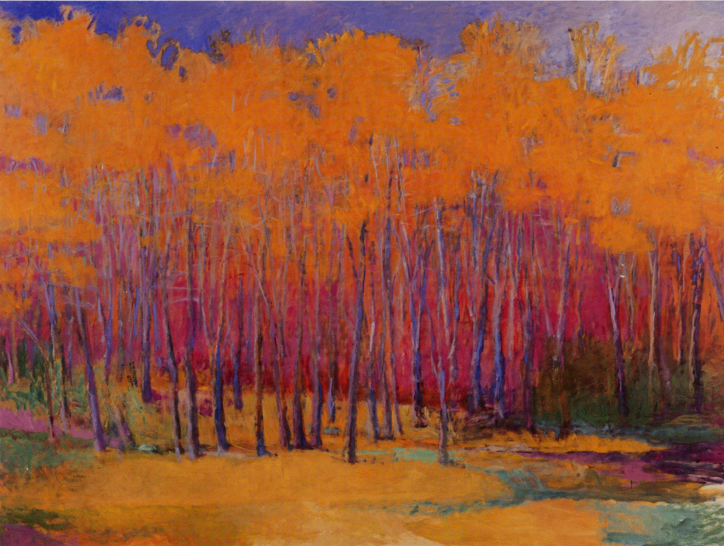
I chose this piece because I loved the warm colour palette throughout, I think it shows the different textures he uses in the trees. The different mark makings he uses throughout this piece is effective and has shown many ways of difference compared to the historical artist. He blends the different colours together so well and can clearly tell the different features throughout this piece of work. I enjoy seeing the different tones of the shadows and lighting in the trees to see the dark and lighter tones of the bark. It makes an interesting look for the landscape and you can tell the realism of all the bark features. I think the artist has done an effective way to show the different of texture throughout the tree canopy to show the leaves with the dabbing techniques, it shows the softness and the way the leaves move in the trees.

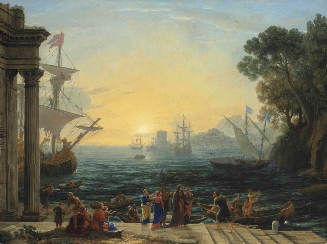
El greco is a historical Greek artist, sculptor and architect of the Spanish Renaissance.The artist normally signed all of his work in his full name in greek lettering, his work is very realistic and famous during his era. His work was all different subjects from portraits to landscapes but I found his landscapes fascinating and I always love seeing paintings done from such an early period.

Below is the piece I have chosen for this artist, I found this piece interesting as it was completely different to my contemporary artists and the colours palette is different, I feel like in this period of time it was very realistic and it wasn’t often you would see a bold piece of work with different and bright colours.

1195d52fd58297aa52281261bc222bc37abe89d3

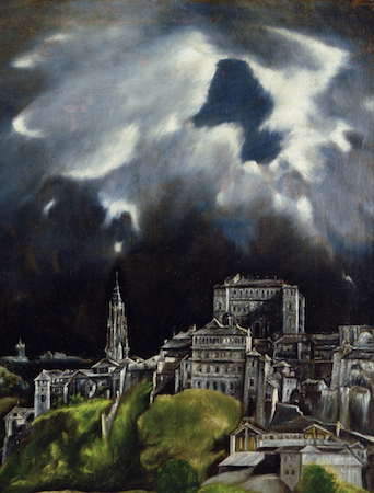
This piece of work stood out to me as I found it realistic and the different lighting throughout this scene, the shadows shown on the buildings are strongly realistic and it creates a great effect with the whole landscape. The sharpness of the colours stands out and shows the gloomy day that the day was, I like the textures used on the grass to show the softness compared to the building. The markings in the buildings show the age and the stone throughout is clever. I always fine it amazing that we can still see the work that was done from that era of time and how talented they were to do these amazing pieces of art. I love the different sparks of colour in the sky to show the light of the sun peaking through the clouds. I think both artists have a lot in common that we still use the same techniques now as we did then, all the different mark makings in this piece the contemporary artist has used to but in a different way. I think it’s amazing how we get inspired from so many different ways and create such different things at the same time.

These two artists created two very different styles of art yet both of the artists have use similar mark makings throughout, they both focus a lot of mark makings and making sure the landscape shows it’s different textures throughout. I think both artists have a different sense of view finder, the contemporary artists focus’ on the trees and a natural landscape he puts his own twist on the landscape and doesn’t keep it completely realistic, the colours he uses. They are bright yet the historical artist uses realistic colours and focus’ on a man made village, I think this shows that as time has gone on we artists have again become a lot more adventurous in how they express their art other than keeping everything look the way it looks they explore more and experiment with different colours.

Both artists are different in so many ways, yet I think with all art they want to recreate the full scene how they saw it that day and what they felt. Both pieces of art show atmosphere and create a completely different one in each piece. The different shots of colour in both pieces create similarity, from the historical artists with the shows of sun light making their way through the clouds and the contemporary uses flash colours in the ground and along the trees canopy to show the softness and colours of the leaves. Both artists have different styles yet they have similarities in different ways, I enjoyed comparing all of these artists and seeing how as time as gone on how more adventurous artists are as well as experimental, it really has me inspire.
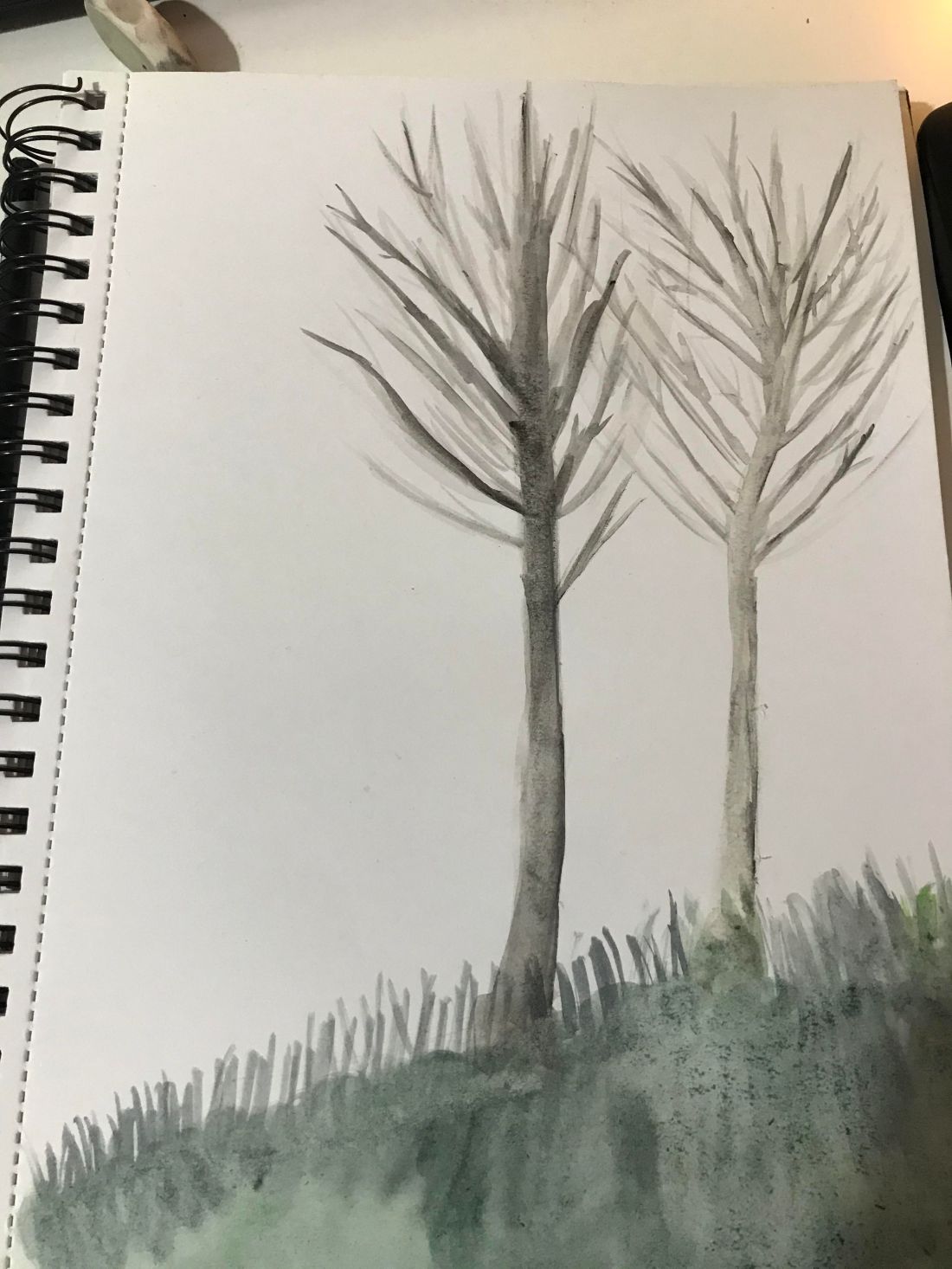
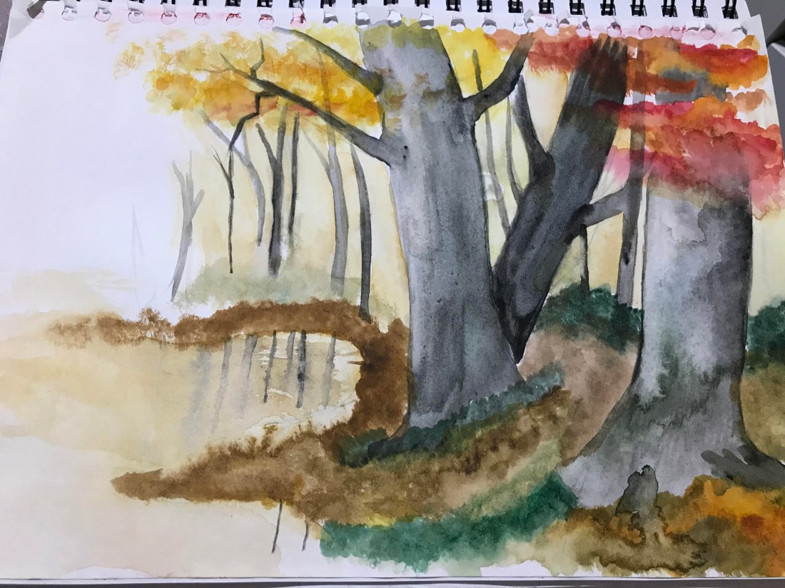
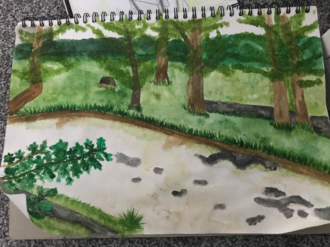


Exercise One- Developing your studies.

In this exercise we were to review our work from the past exercises and pick one piece that has stuck out to us, then to further the work into a larger scale and different medias. To show different skill and a different look onto the composition and landscape we have chosen. For this piece I decided to spend more time and do a larger scale image of the lamp post in  my garden, I thought this was an interesting scene to recreate and I wanted to do it with colour for the scenery in the background.

Below is a picture of my result, I decided to use a media I don’t usually go for which is coloured pencil and sketching pencils:

unnamed

In this picture I decided to experiment with different mark makings to show the effects of different textures in the landscaping around my garden, I thought this would create an interesting effect in the background. I liked the idea of keeping the lamp post fully black and white and create this colourful background of the landscaping, I do think this piece is good and I showed off some mark making and different tones throughout the lamp post. I would like to further my experimenting with different medias and take influence from artists to trial and error different art styles. I do think I would like to look into using different techniques throughout my art work and try to show ways of the textures in the landscapes.

All in all I do like this piece I will continue to trial different materials and techniques in my work to create different work. I want to create more mixed media type work and experiment with different ways I can express landscapes. I will continue to try out different styles of work and look into different medias to express in my exercises, I do think this piece is good but I will continue to look into different ways I can improve.

Artist research- Nicholas Herbert

Nicholas Herbert is a mixed media artist in which focus’ on landscapes. He had a solo exhibition of 25 pieces of landscape art pieces which showed at Alan Kluckow Fine Art in April and May 2016. His collection “The Chiltern Hills” was selected for the exhibition at the Royal West of England Academy Open 2016.

Below is a piece of his work I have selected from “The Chiltern Hills” collection to take a closer look at.

L934-web

I find this artists style of art very unique, the colours he has chosen to use in this piece it shows a gloomy day, I can see the type of scene he was recreating and I think this is clever in his work. In this piece he uses various different materials and I find that very interesting also, the way he can build up all different medias throughout one piece is fascinating and it creates a really interesting effect throughout and you can see a hint of all his different mark makings during the full piece. I like the different scratches along the bottom of this work and how the different tones create different elements of this piece, it shows the different stages and depth throughout the landscape.

All in all I like this style of work, I think his different mark makings and materials through the piece. I like the build up of all the different medias and wold love to give this a try myself. I have past pieces of work I have done using mixed media and I used to enjoy doing them so much so throughout the rest of these exercises I may include different styles of work and build up my skills using different materials.

Exercise 1- Cloud formations and tone

In this exercise we were asked to look at the sky and experiment using a form of material to show the formation of the clouds, for this piece I chose to use charcoal pencils in response to my previous artist research. We were asked to look closely at the different tones throughout the formations and create a rough scene for the clouds.

Below is the image of my final result, I found this task more challenging as it was difficult to get the drawing to actually look like a cloud:

IMG_5937

I did find this piece a little more difficult than I’d expected it to be, to get something to look really light and make it look like a cloud when clouds are white , I found it harder than you’d think to get the right tones etc. I do think that this has turned out well considering I haven’t tried to do anything like this before. I do think I got the lightness of the clouds well, I like the tones of the piece I have created and the look is what I firstly did imagine. I would like to use charcoals more because I did like the types of tones this piece gave and it was so easy to smudge and blend.

All in all, I do think this piece has turned out well and I am happy with the outcome, if I was to do it again I would experiment with another material just to see how it looked. I think the lightness of the cloud did come across as well as the different look of defining the different clouds.

Artist Research- Landscapes

Laurence Stephen Lowry

L. S Lowry was an English artist, most of his drawings were drawn of his home country and where he lived for over 40 years, Lancashire. His most famous work is his work which was inspired by industrial landscapes, he has a distinguished art style and people know his work all around. He also would paint unpopulated landscapes which weren’t discovered until later after his death. His work was very popular around the 40’s and became very quick due to his local artwork which people adored.

Lowry, Laurence Stephen, 1887-1976; Going to Work

I chose to analyse this piece of L. S Lowry because I think it is a classic. The piece is called ‘Going to work’ I think this piece is purely classic of the morning in a city and seeing everyone on their way to start the beginning of their days at work. I have seen this artists work a lot whilst growing up and I’m sure my grandparents have a copy of his work in their home. I think for their generation he was a very beloved and classic artist during their era and a lot of people admired his work for being so homely and showing normal every day life in industrial scenes.

I think people seeing pieces of art work in a unique form and to do with towns and villages like their own makes them feel some what special and it really draws a viewer in. I like this artists work especially because I think his style of work is unique and shows a different look on industrial landscapes and makes them look just as bright and unique as a countryside or beach. I love the colour palette e uses in all of his work and I really enjoy how all his work is similar but different at the same time. His work isn’t realistic but it shows lots of different details and approaches to viewing cities. It really inspires you to look away from all art having to look like something in every way and super realistic and look at things in a different light! I love love love this work and will take inspiration from all of his features.


George Shaw

George Shaw is a British contemporary artist, he focuses on realistic places in the English suburbs,  his work includes capturing paintings, graffiti, litter and architecture around the country. Today, Shaw’s works are held in the collections of the Royal College of Art in London, the University of Warwick, and the British Council Collection in London.

GS 2017 The National Game

I have chosen this piece of work to analyse because I felt I was drawn to it right away, I was confused when researching this artist because I was so sure his work was photographs! It’s amazing how most of his work for landscapes looks so much real. I honestly had to blink again. I love the way he focuses on areas nobody would normally take a second look at. Usually we (most of us) see these area’s on a daily basis and never would blink an eyelid to focus on it’s beauty. But this arist just captures reality and I was really drawn to that. I personally would never imagine wanting to paint or recreate this type of area but seeing it being done is amazing.

I love the way he can capture an area and make it look so realistic and loveable. He focuses on places we all know and we can all see and makes them look really interesting. I love how rural it is. The way this artist captures the lighting even to show the reflection amongst those puddles is simply amazing. I like how he has managed to make a dull area seem light and he really focuses on how the lighting hits every feature on this work. All in all I love his work, although it is never the areas I would think to paint I think it’s fascinating to see done and has made me want to focus on reflections within landscape as well as looking at more rural areas to use within my own art work.

Artist Research- Landscapes

Albrecht Durer.

Albrecht Durer was European artist who created a high reputation and influenced a lot of creativity in the 14’00s. His work became famous and his main focus was woodcut print, as well as a wide range of different media’s such as : engravings, altarpieces, portraits and water colours. He said a wide range of different artistic features.

I took the interest in looking into his landscape work and seeing his technique when it comes to recreating a wide angled piece of art. I found I was fascinated by his creatively and enjoyed looking at each piece. I think it is so amazing how art has been carried through this world for centuries and how amazing it is we are so easy to look at artwork that dates back this long.

This piece below particularly took my attention as there is a lake sitting in the middle of this town. His attention to detail throughout this piece is amazing and the techniques within using watercolour is fascinating. I love the way the lake has reflections along and the lightness of some area’s makes the water look so realistic. Along the left side there is light white strokes where it’s created the effect of the water crashing along side the bank and I think this is a really effective method I could use in my own artwork.

The way he change’s the tones around the mountains shows the depth between them all and really looks far back from the town because of the way he has worked with the lighting and the shades of the water colour have really made a memorising piece of artwork.

trento

All in all, researching this artist has got me really excited to experiment more with my water colours to get more of a skill on making landscapes and pictures. I would love to recreate full scenes like this way in such a realistic and wide angled manner. I think the water colours really add to this piece of art and make it even more amazing.


Claude Lorrain

Claude was a famous French landscape artist, he spent most of his life in Italy and soon became the leading landscape artist in Italy. His work became bigger and bigger as he earned more money. In 1630’s he soon ranked up to being the leading landscapist in Italy and was well known by everyone as well as charging large amounts for his outstanding and famous work. He was one of the first artists and was known for showing the Sun into his work and playing with lighting which had been a rare sight in the past.

2013_CKS_01164_0021_000(claude_gellee_called_claude_lorrain_a_mediterranean_port_at_sunrise_wi)

I chose to analyse this piece because I thought it had a good understanding of the contemporary feature this artist brought into to new art work of his era. He demonstrates the sun and shows how sun has effected the lighting all over this landscape. I think the way the artist has been able to show light across the ocean and get the effect of haze above the water is fascinating. I always find historical artwork fantastic to think people could create this art work to last for so long in a time where photography and technology in general is no where what it is today.

I love the way he has made such an impact on this whole piece of art by the power of the sun. He really has captured such beautiful lighting and realistic tones all over this piece. I love the amount of detail in every feature in this place and really gets me inspired to develop painting and get to be able to recreate such beautiful landscapes myself. All in all I have taken a lot of inspiration from both of these artists and will take features from both to help develop during my exercises.

Independent studies- trees

Whilst going in between exercises I wanted to take some time to study with water colours and only watercolours,  I took an image of two trees and I tried to recreate the slightness of them both and the dullness of both of the trees.

unnamed (3)

In this piece I just purely wanted to experiment with using just watercolours and nothing more. I focused on these two winter trees because I liked how slight they both were sat together. I wanted to experiment with lights and darks and using the whites against the black, I liked how easy it was to blend the colours together and create the colour I wanted and the texture I wanted.

If i was to do with piece again I would spend more time on the background and add feature to create the full image, I was happy with the outcome and will continue to use watercolours throughout this assignment.

Exercise 3- Study of Several Trees

In this exercise we were asked to focus on a group of trees to look into the different colours and textures of trees grouped together. Using a different material to our preferred one and focusing on the tones and different ways the light shines. We were told to spend at least 2 hours on this piece and I spent just that, I did use a picture on google to complete this as I wasn’t feeling well enough to go outside.

In my piece I decided to look at an autumnal woodland because I thought the colours would be the most striking and I liked the idea of incorporating watercolour to pop the colour out a lot. When doing this piece I found it fascinating to look at all the different colours and focus on the changes throughout each tree. The leaf changes and also the texture throughout all the different trees. In this piece there was also a lake; I found this a really amazing thing to recreate and I loved adding in the trees reflections.

unnamed (2)

What techniques did you use to distinguish one species of tree from another?

Throughout this piece I used various different techniques, I used the method of blotching my brush along the bottom to get the effect of mud along the lake, I also used different water techniques throughout the trees to get the lightness on the trunks. I also took a fan brush and did quick strides across the water to get a light reflection look across the top. In this picture I looked at the different textures between the trees and could tell the difference in the types of trees. I looked at the mass on the tree compared to the trees in the background so it grew easy to see the different types of trees.

How did you convey the mass of foliage and the spaces between?

When looking between the trees and seeing the different foliage on the trees I looked closely to see where it parted between the colours on the trees. As my picture was the lower part of the trees mainly there wasn’t much foliage to have on the trees yet I looked to see the different blocks of colours throughout and based my art on that.

How did you handle light on the different parts of the tree?

When it comes to the lighting I just looked at the lighter parts on the pictures, when I did that I could envisage where the light from the trees was coming from, I could spot the shadows and where the lighter parks of bark were and where to aim putting the more light tones in my image. I could see the light on the water and see the whiter tons and where to angle my shadows to.

I enjoyed doing this piece as it took me out of my comfort zone with the usual sketching or using pen to do my art. I liked experimenting with different colours and using the water to create different tonal work throughout the piece. If i was to improve this piece any I would do a larger scale to challenge myself a bit more. I would also not sketch out my image before hand, I think I have an old habit of being too nervous to go straight into a piece of art using just paint or watercolours because you can’t erase, but now I’m more skilled within art I’m going to try to take myself out of that comfort zone.


Exercise two/ independent exercises

After completing exercise two I decided to further onto another piece using the same exercise method of going into detail of the trunk of the tree but using biro pen instead. As experimenting went so well with the chalk I thought I’d try with another material.

In the past I have done a lot of work with biro at GCSE level and also BETEC, I used to go to this material all the time for a messy look or to gather more of a boldness to my work, therefore I thought it’d be perfect for this exercise.

Below is a picture of my result:

I am really glad I decided to do this second piece as I think the detail the biro creates is great, it picks up the detail and different shadows on the tree and really has a unique look on the drawing. I like how the biro was when it came to doing different tones on the trunk, building up shadow and aspects of the tree was really easy and I think the outlook looks really good. I’m happy with how this overall piece turned out and I think it gives a different look on the tree trunk all together.

If I was to change anything or this piece it would be to focus more really closely on the individual details of the trunk and to perhaps do a full drawing of the tree not just a section other than that I think this piece turned out really well and I will be using biro again in more of my drawings!