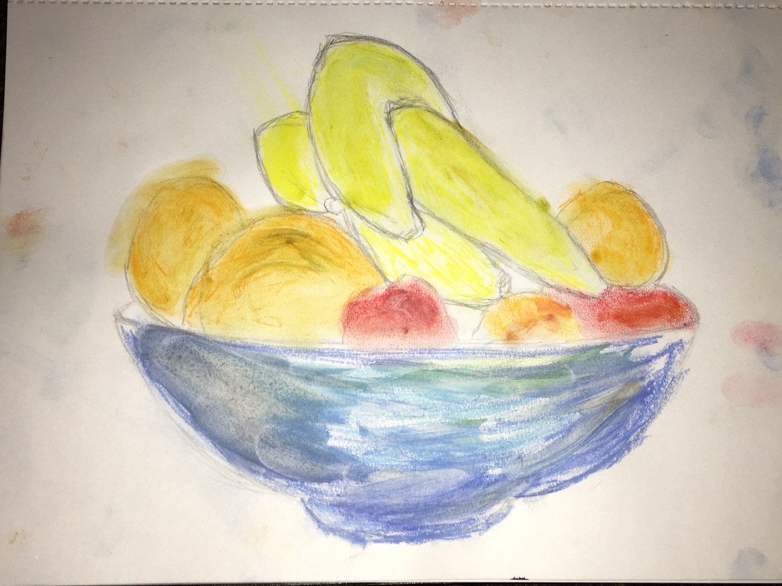
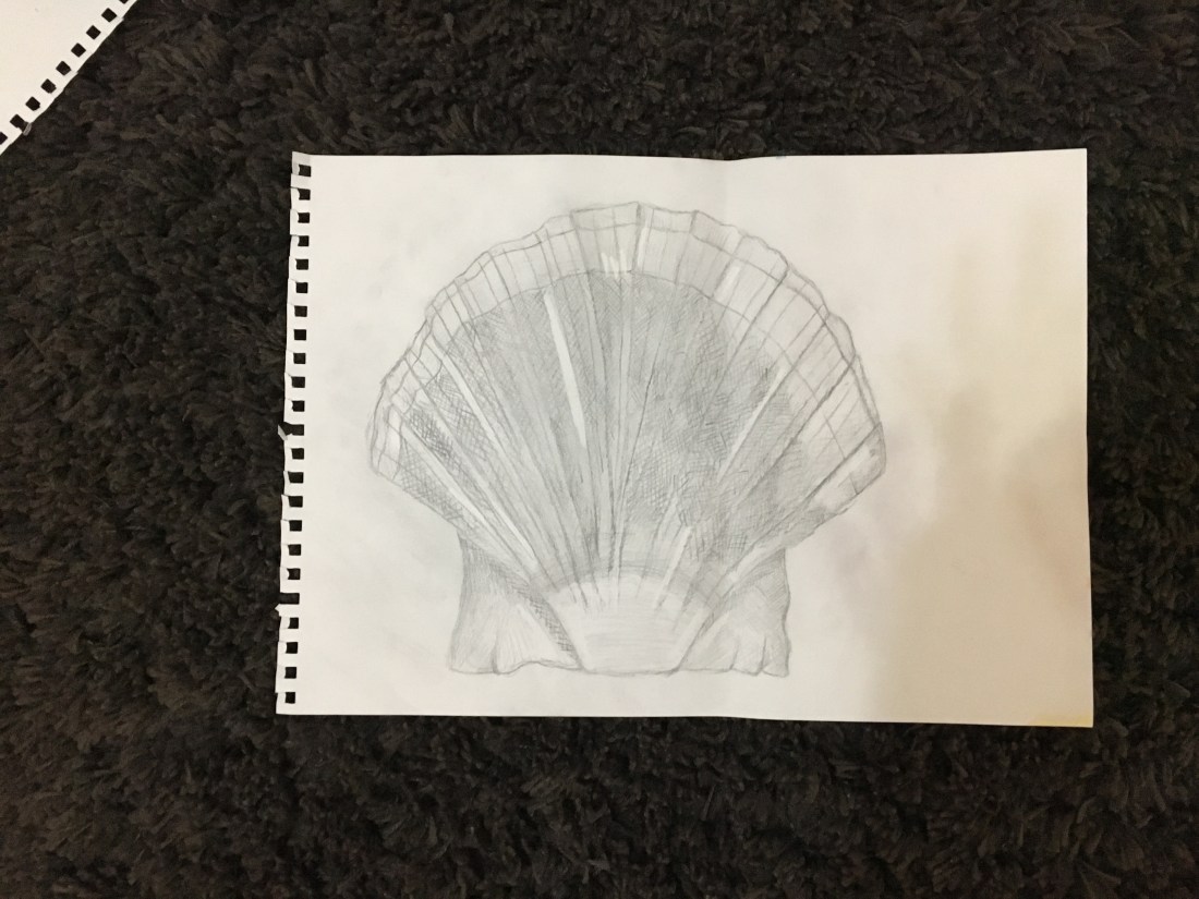
Quick sketches around the house.
For this exercise we were asked to grab out sketch book and a soft pencil and make our way around each room in the house making fast visual observations and making four quick sketches from four view points of the room. In this exercise I decided to do sketches of : living room, dining room, kitchen and my bedroom. I didn’t feel like I needed to draw the toilets or my parents room. Below is a pictures of the results:
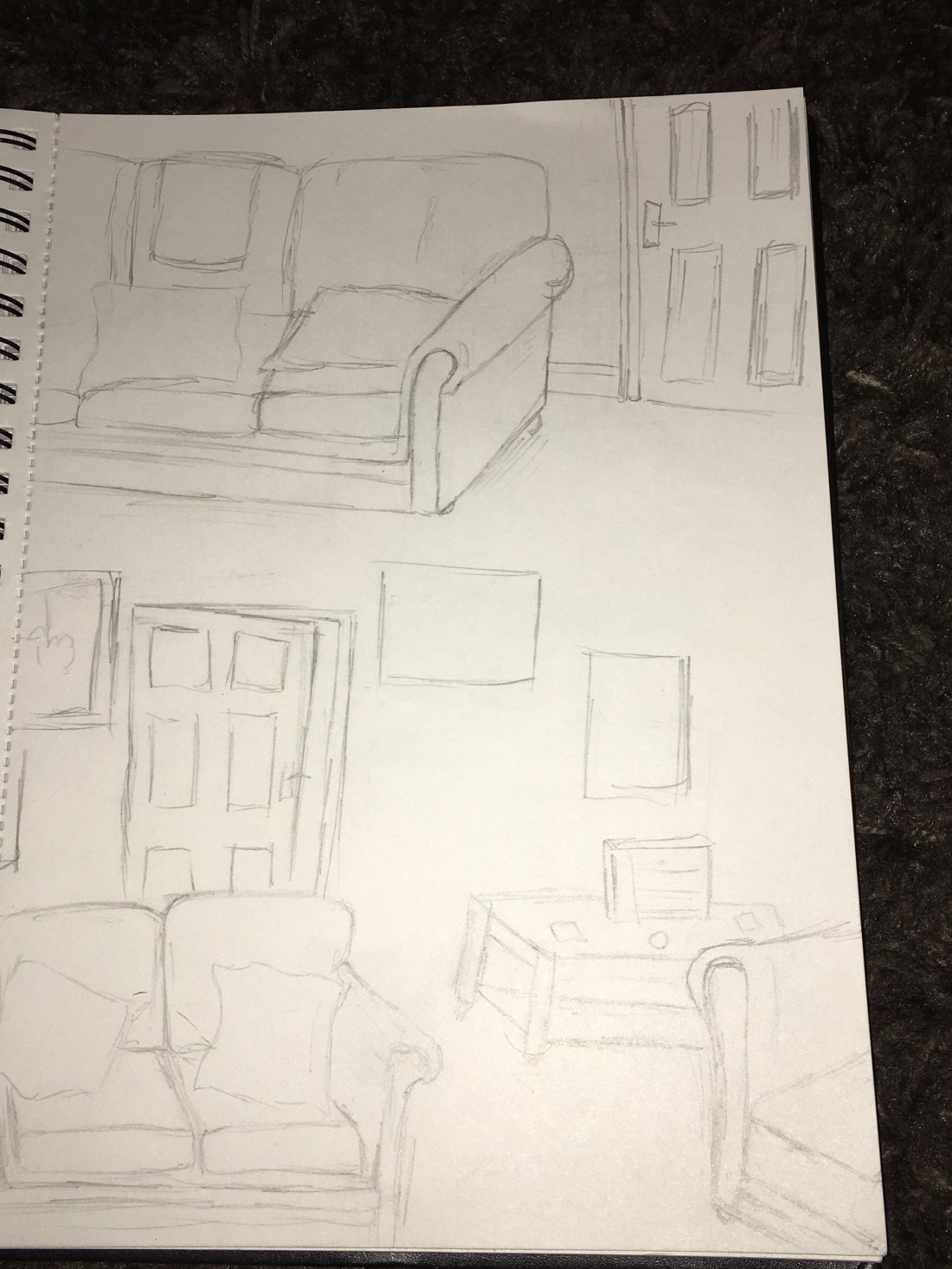
Living Room.
This room I found interesting to draw as there was a lot of different items and I enjoyed looking closely at the textures and depth of the items instead of glancing at them like I usually do in my daily life. I found it was difficult to scale things down but once I did I liked recreating a miniature version of the sights I was seeing, all in all I liked doing this room as I found it fun to recreate and scale down the furniture and it was more of an easy room to recreate through my drawing.
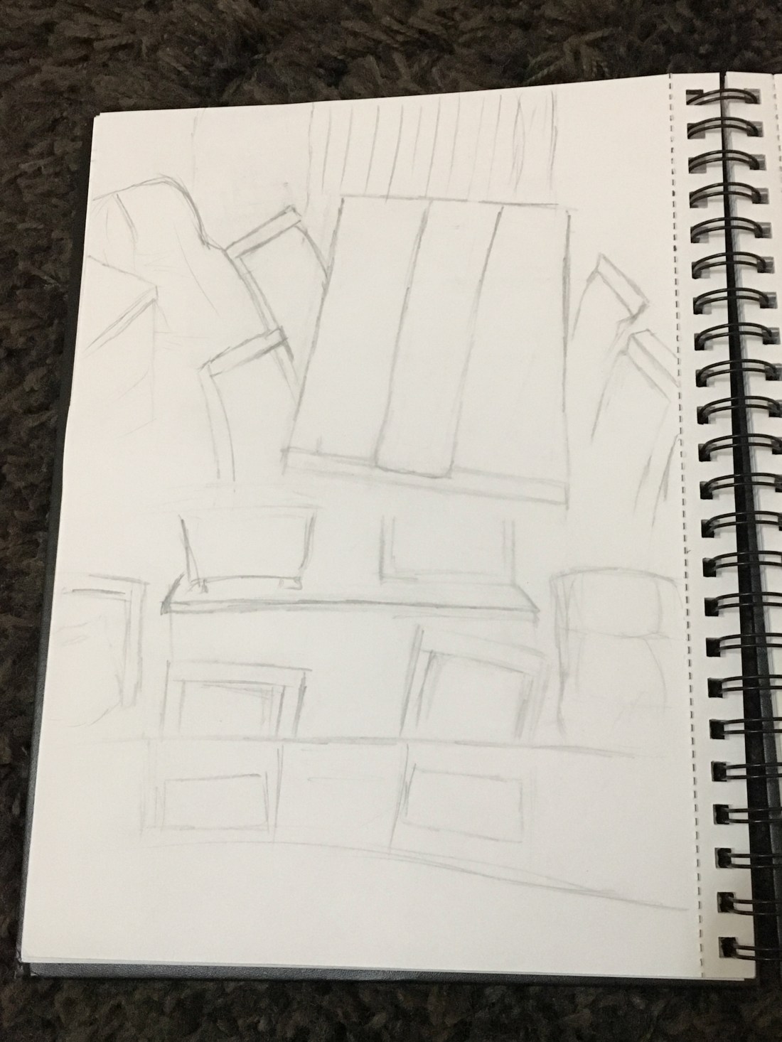
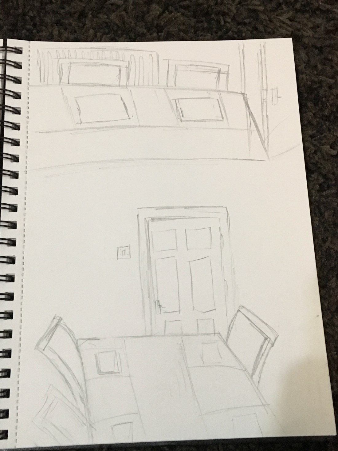
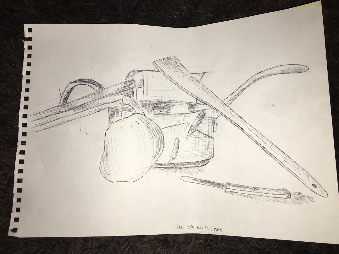
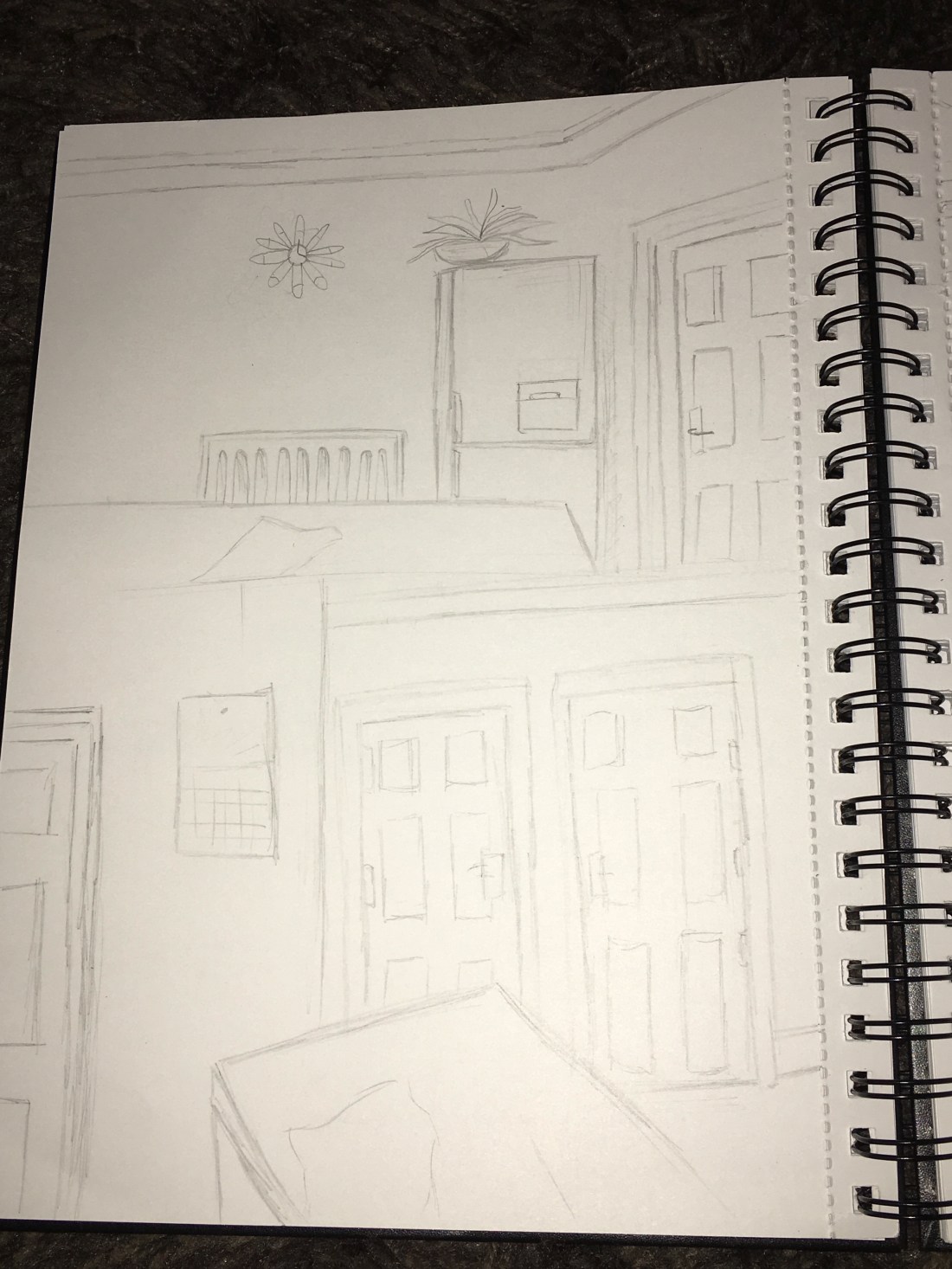
Dining Room.
The dining room was my least favourite and I disliked recreating this room all together, I found that the items were difficult to represent in the angles I was seeing and to make it look realistic was difficult. I wasn’t too impressed with my final outcome of this room and I found it was pretty bland. The chairs were difficult to position in my drawings to look on the right angle. I would not like to work on drawing this room again.
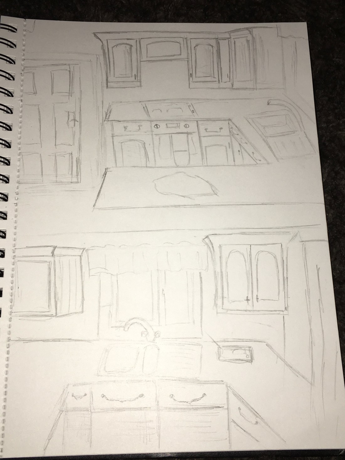
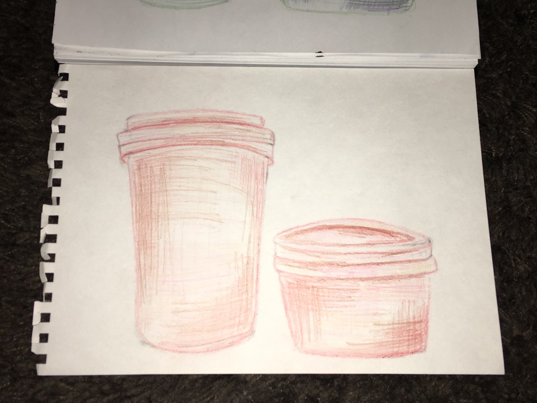
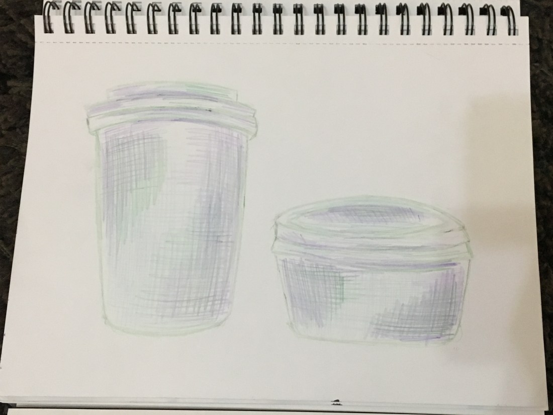
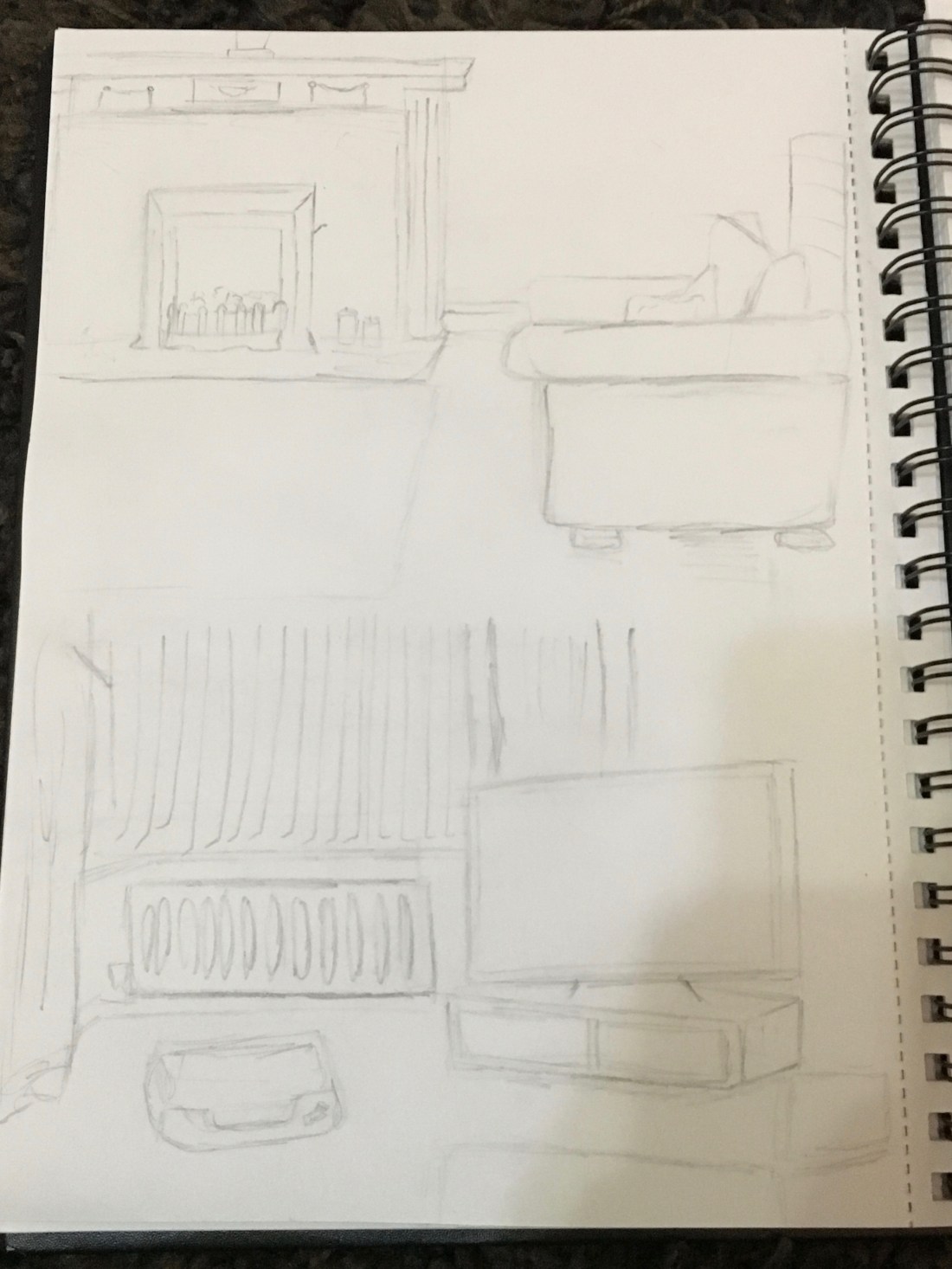
Kitchen.
I enjoyed doing the kitchen the same as the living room, I found it was fun to recreate the character of the room and to get to terms again with the layout and texture of the room I go into everyday. The cabinets turned out to be a challenge but I felt like the end result really worked out and the sketches I produced were an accurate viewing of what I was visually seeing when sketching. All in all it was one of my favourite rooms to recreate.
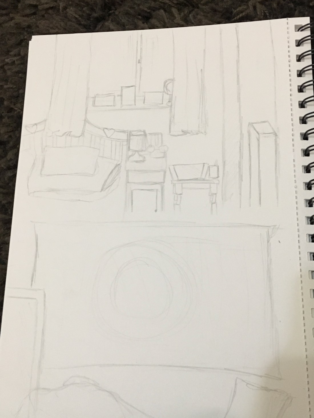
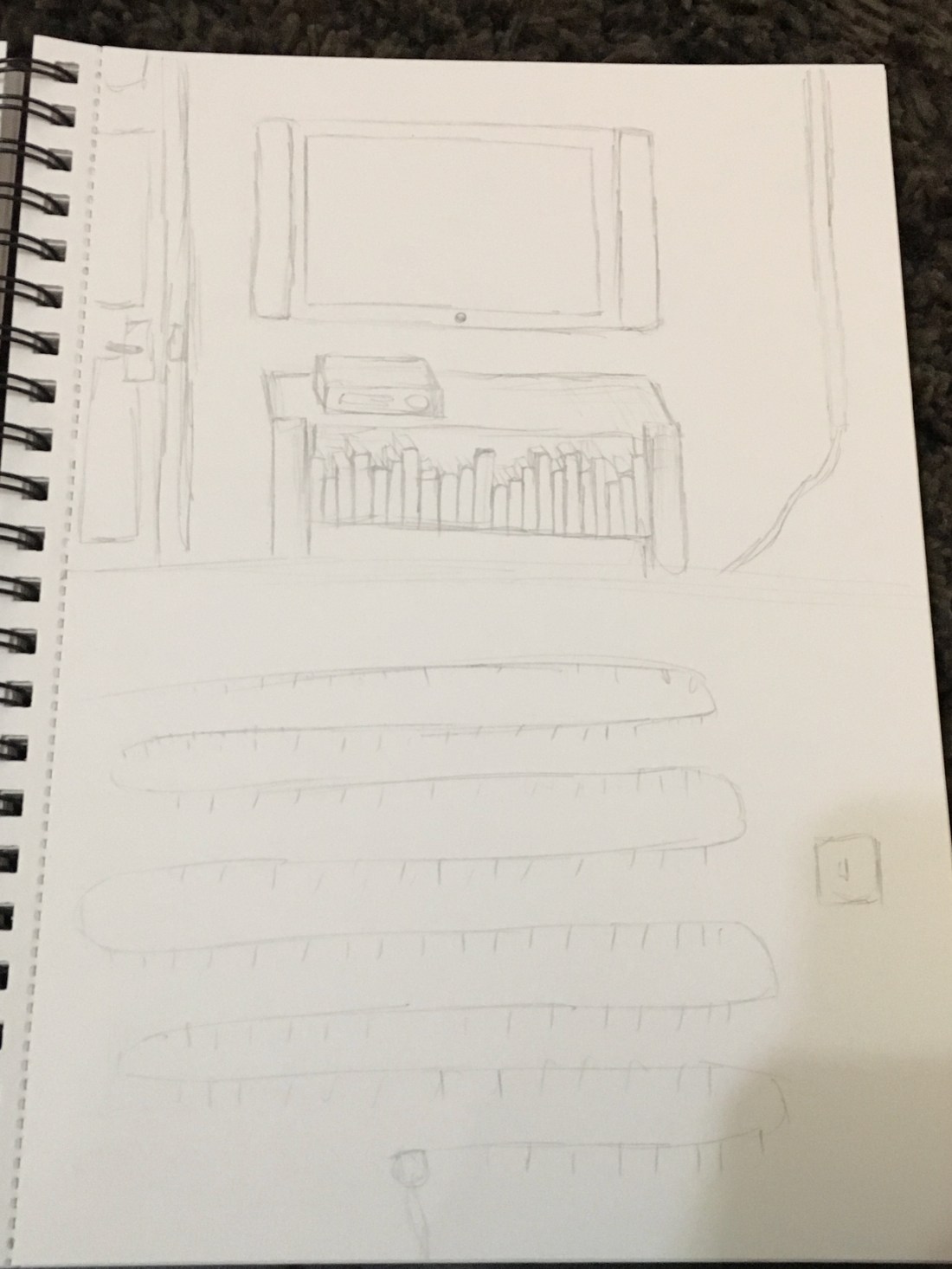
Bedroom.
I think that this room was my favourite. Seen as my bedroom is my canvas to create with as I live with my parents I loved really looking into the details and sketching out the room I have picked everything out for. I loved filling in the details and placing things exactly how it was seen in front of me, I think this was the easiest room I had to recreate through sketching.
Overview:
This exercise was really fun, I loved recreating the place I live in and looking at things more in depth than usual to sketch it out. I found it helped a lot with coming to terms with quick still life sketches and helped me advance my sketching skills. The room I most enjoyed recreating was my bedroom as it’s personal to me and I had fun creating a miniature version of where I spend most of my time. All in all I found this exercise really helped me advance on my skills and made me think more about how to view and angle my drawings.