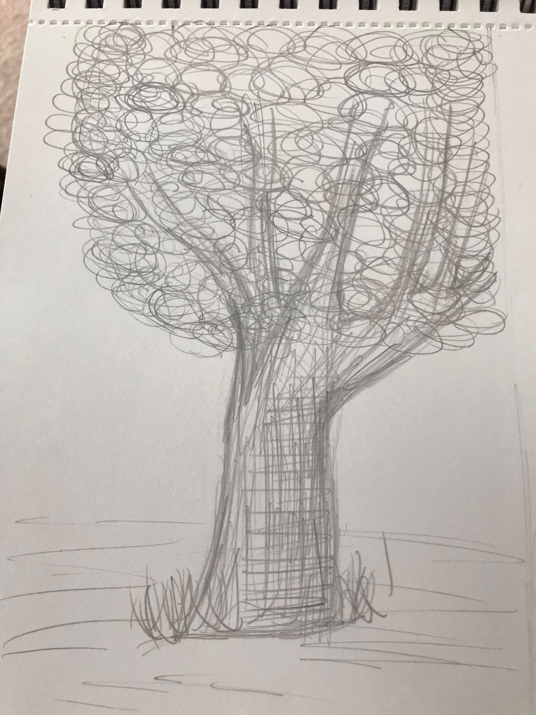
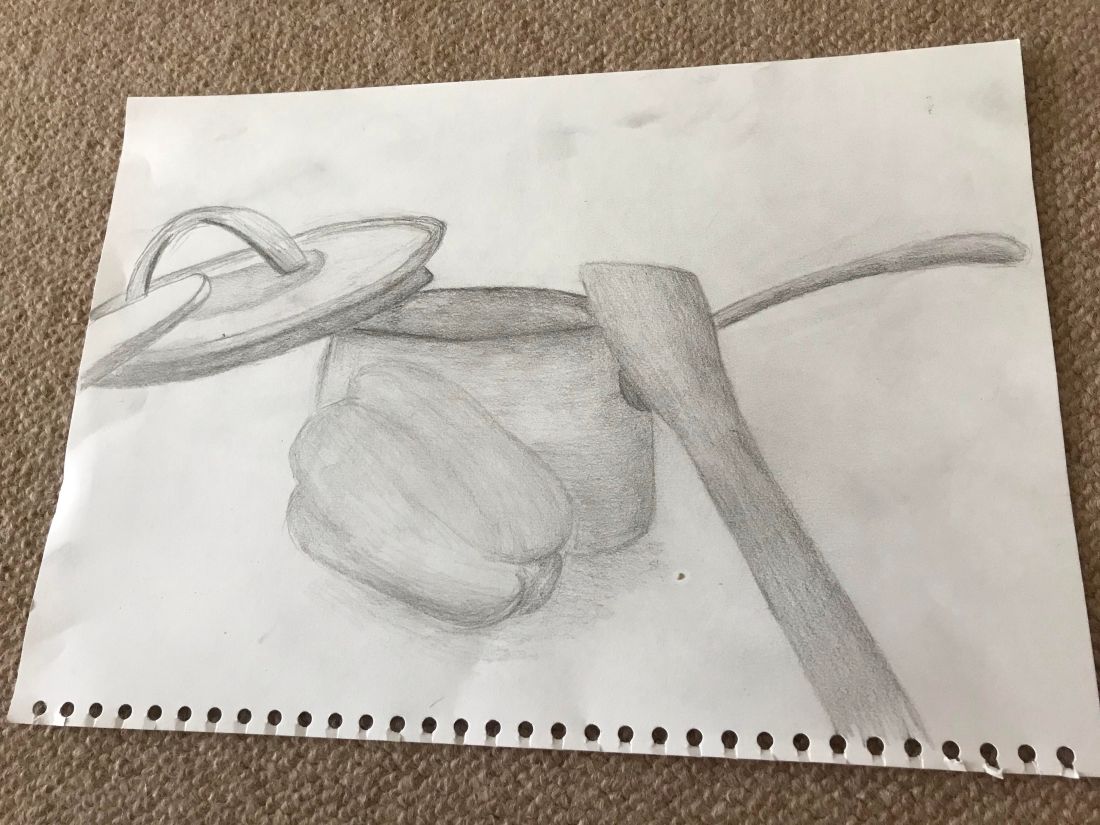
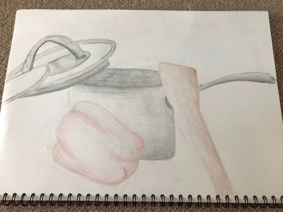
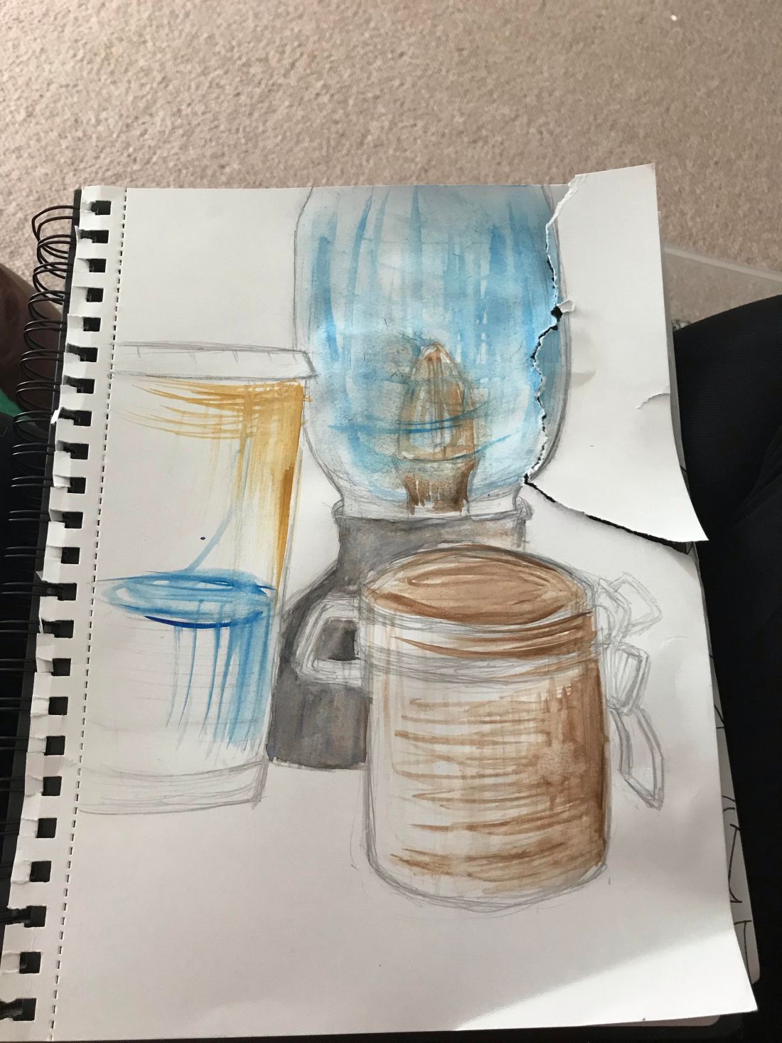
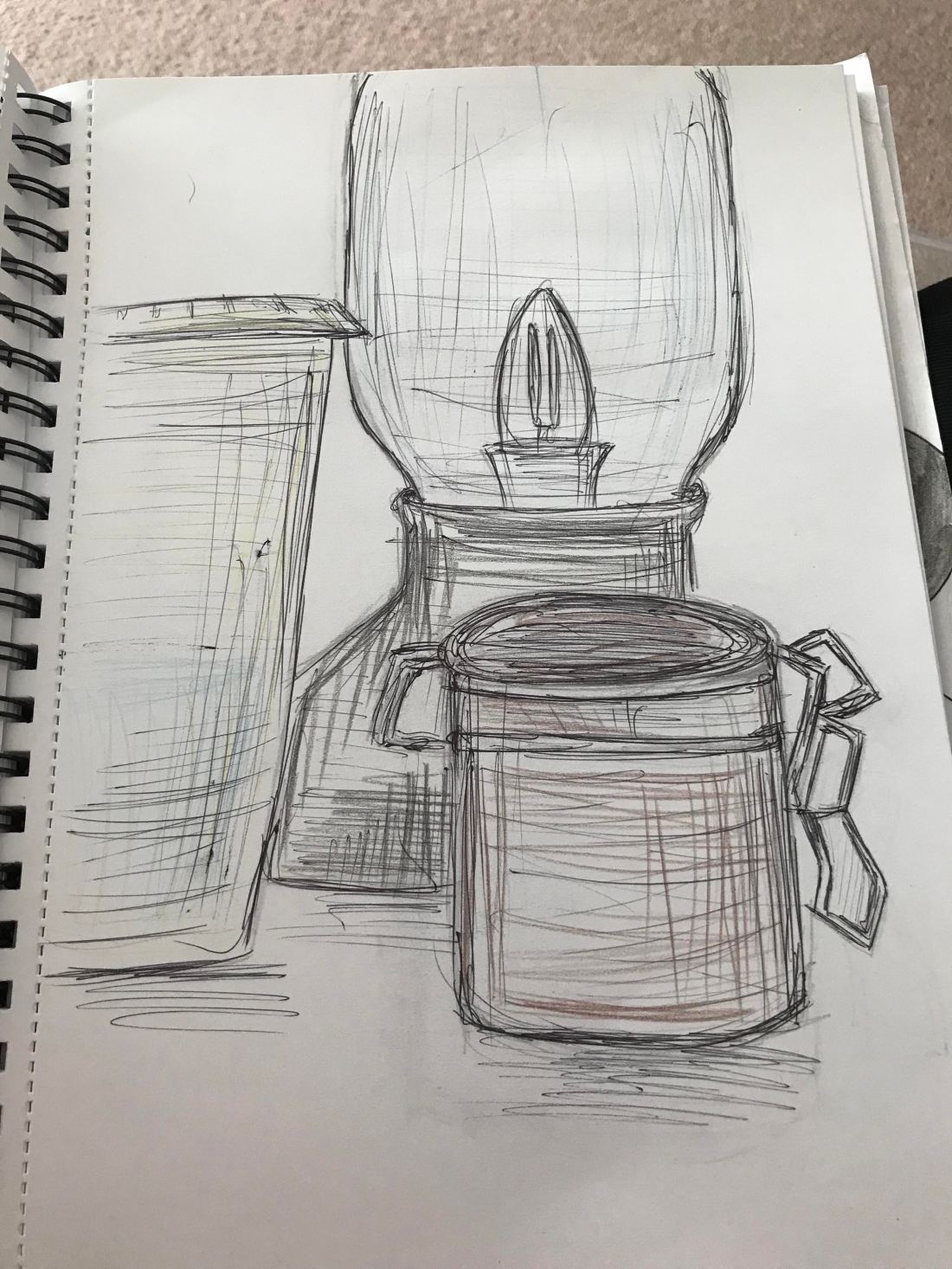
Experimental piece – sketch book work

Seem as the new project/ assignment is revolves around tree I wanted to do some experimental work in my sketch book to get used to the look of trees and how I go about the detail in my drawings and using materials I wouldn’t usually pick to draw with.

In my assignment two feed back I was told to spend more time doing work in my sketch book and developing on my drawing skills independently to advance my self more on sketching and quick drawing as well as exploring new materials and ways I can draw.

I was always a bit apprehensive about drawing with charcoal as it’s not a material I would ever pick up and draw with but once I started on this drawing I loved the way it felt and the texture it brought to my drawing, I felt it brought the tree more alive and enhanced the detail in a different way a pencil would do. It shows it strength and how dark the trunk is but also shows the softness I want to show for the leaves falling over and hanging above the structure.

I found this piece very fun to do and has opened my eyes to using and experimenting with more materials within my work instead of sticking what I’m used to. I’m proud of how the tree looks and I’m excited to further on with this part of the drawing course.

Trees- Exercise One.

For this exercise we were asked to draw four separate drawings of the same tree doing different forms of exercises. The first one being to do a simple and basic outline of the tree to get a basic idea of the form and the shape the leaves form such a big volume around the tree. The next one is to draw basic shapes in the outline of the tree and to start some initial shading to form more dimension of the tree. Furthering onto doing a basic outline and look onto the branches and the trunk of the tree, the last one was to draw with lots of scribbled lines and add some shading whilst forming a way of showing texture of the leaves onto the trees.

Here is an image of the first drawing to do, this being an outline of the basic tree shape:

unnamed (5)

This piece was fairly simple, it was good to get a rough idea of the basic outline of the tree and to look around the tree rather than just inside the tree. I think this piece clearly shows the outline of the tree and how I have tried to include the full outline including the volume on the tree that the leaves will form.

This next piece is to add some branches and shading to the tree and focus more on the inside shapes and tones of the tree:

unnamed (6).jpg

This piece was a fun to do as I liked to outline the branches and add a little more detail to the tree and add some tones to the trunk. I also added some grass around the bottom to get more of a detailed outlook to how the tree looks as well as some leaves so it gives more of an idea what the outlook on the tree is. I found this piece interesting to do because I was looking at different features of the tree other than just looking at it as a hole. I found it quite tricky to identify the different branches but I think this piece gives a good outlook on the shading and structure of the trees.

With this next piece it is just a look at the structure and the branches of the tree and to have more of a look of the trunk, here is a picture of my piece below:

unnamed (7)

This piece is simple but I think it gives a good idea of the structure and trunk of the tree focusing more on the inside of the tree rather than the over all look, I think I got an accurate outlook onto the trunk and branches. I also added a look at where the leaves and over view of the leaves go which give the tree its main volume.

The last piece was to add some more tone to the over all look of the tree and to also use more scribbled lines to the tree as well giving the leaves a texture to define where they go throughout the tree:

unnamed (8).jpg

I enjoyed doing this pice because it was a little messy doing the lines and I didn’t care so much to get an accurate shape of the tree more like a scribble sketch of the overall tree. The shading I wanted to do some cross hatch to get more of a detailed and dark shade to the trunk. I only did the main branches of the tree for this piece to show off the main structure of the tree and not to do so much detail. I also then decided to do swirls and dark lines for the texture of the leaves because I thought it gave quite a light look which is what the leaves look like when being part of such a strong structure and this I did all over to really show the impact the leaves have on the volume of the tree.

All in all, I really enjoyed doing this exercise because I think it gave a different light on the tree and gave me a chance to look more in depth at the structure and inside of the tree as mainly when you look at trees you just see it as a whole and don’t really notice the strength it has or how the branches really make up the tree and how much volume the leaves actually have on the whole of the tree. It has made me excited to further looking into the details of trees and using different materials and medias throughout.

Assignment Two – Final piece’s.

For this assignment we were asked to experiment with colours and show different ways of mark making throughout taking ideas from our previous’ exercises to get a rough idea of what to do.

Therefore for this assignment I began with two small pieces to get an idea of some experimental work with mixed media. I wasn’t to keen on the results of these two designs so went back and thought through what might be better for me to do, therefore I went for a kitchen/cooking style still life and tried two methods I felt comfortable with.  Below is a picture of my first drawing where I just used a sketch pencil and toned with the shadows and tried to go in depth with the shadows etc.unnamed (1).jpg

As you can see in the final outcome of this piece I have tried hard to focus on the tonal work of these objects and have continuously used different mark making from crosshatching to using a rubber to make marks in the lighter parts of the objects. I like how this piece looks as I think the lay out of the objects is effective and you can clearly see where the light is hitting the still life. I feel like in this drawing I have developed within using harsh lines for the outline of the objects as in I haven’t shown heavy lines throughout and the tonal work in general is a big improvement on my past piece’s of work. I strongly enjoyed doing this still life piece and think the out come is good.

Moving on to piece two I took the same still life and just coloured the drawing in the best way I could seen as the big part of the picture was the pan which is already silver. Looking past that, it was a big difference to work with colour as I’m not usually one to work with coloured pencils yet I enjoyed doing it and think I’ll further with doing this in the future. Here is a picture below of my result:

unnamed (2).jpg

Again in this drawing I used a range of different mark makings to enhance the different tones of the objects, I do like how this piece turned out I think the colours pop the image out more and it makes it look more realistic, I think I still need to work more on using colours as it’s only been a couple of times for me using it, but I think doing more personal trials in my sketch book it will help me improve my skills. I am however happy with how this turned out, I think when I do these style of drawings again I will try and include a back drop to make the full image come more to life. All in all I think I have improved in my drawing skill since first starting and I’m happy with how I am coming along. I do think to improve my skills now I will try to add little details into my work and also doing a back setting will help the image come alive a lot more.

Assignment 2- Practice and planning.

In preparation for this assignment I wanted to test out a couple of different ideas I had to then take further with the style I preferred,  I wanted to do this piece and reflect on the style I have been doing throughout my work and I found most comfortable with me that shows what I have learnt throughout this project so far. I also picked to be a little experimental with the work and try something different to see and attempt that as well.

I first decided to do this because I wanted to experiment with different ways I could incorporate colour like the brief suggests. I wanted to see how the watercolours would go with the design and using different colours to create bold effects, heres a picture of my result:

unnamed (3).jpg

I found that this piece didn’t go as I had firstly envision, therefore I decided to re-do this piece after because the colours weren’t as bold as I wanted it to look and the whole thing just didn’t look correct. I thought I would add this picture as a way to show what I have done to experiment with different materials, I think this piece would look good if I used a different brush. I found the brushes I did use weren’t effective and they weren’t very good material therefore I’ve found a different set to use next time I re-do this piece.

I just feel this piece wasn’t the best I could perform and I didn’t look at it and feel I had done my best therefore I think if I try with this again it might have a different result and I’ll feel different about using watercolours on the final piece. I think that the sketch is fairly accurate I would just like to do different tonal work in another trail to really see if I can make that concept work.

unnamed (4)

For my second experimental for this assignment was biro and the use of coloured pencils, I thought that this might look effective and if I thought the biro was too much I thought I’d just choose to do it without it. I think this piece turned out well although I think I used too much of a heavy hand on the outlines of the objects and wanted to show more with the tonal work which I will do in my next copy. Here is the picture of my result:


I do like how this piece turned out although I think I went a bit too heavy handed on the outline of the objects I want to try again with this also to see if I can get a more realistic outlook on it and also go a little more bold with the colours, the picture doesn’t really show the colour I had added so I think I will re do this as well just to trail to see what I actually do want to do for my final piece, I also think I’m going to reflect through my previous exercises and see what might be a good way to represent colour and tone in this final piece and put together a more effective piece than these two.

All in all, I am glad I did these trail because it’s made me see I need to re try and spend a little more time considering what I could do for this final piece and step out a bit more from my normal style.

Artist Research- Sophie Peanut

This artist was suggested to me by my tutor to look into her style of work and look to see how her techniques are when coming to drawing portraits and to take inspiration from her art work.

Once I searched up this artists name I was amazed, I loved her style of work from the first moment I saw it, her work is so colourful and I love the way her work is cartoon form in some way yet her work still strongly represents the person she is creating through art work. I think her work is fun and represents a less serious look on the world with her fun bright colours and words she jots on the bottom of her portraits.

DjmBJ63WwAI5jTW

As shown on this picture above her work is fun and lets out a little lightened approach on some strong topics. Her portraits are fun and I like the way her tones and lighting are still relevant in her art work. The way she represents shadows and lighting on her work is very interesting as it’s like blocks of colours it’s not necessarily blended together it’s just different types of block colour which make the different tones noticeable. Her work doesn’t have too much facial detail yet I think it makes the piece more interesting with the  simplistic look.

All in all I love the style of this artists work and has inspired me to try different types of tonal work and to experiment more with my style to see what works for me, it also has shown me that you don’t have to go full detail and tonal to make an effective portrait and it doesn’t have to look exactly like or a detailed look of the person it can be fun and still be just as effective.

Artist Research- Emma Stibbon.

During my last feedback I was suggested to look into some artists for inspiration and also to look how other artists work during drawing and other types of media. One of my suggest artists was Emma Stibbon which I automatically was drawn to as soon as looking into her style of work.

Emma Stibbon is a British artist born in 1962, her preferred media is print making and her style is monochrome working with landscapes and realism art. Her work is effective to using different tones she affectively creates detail within different shading of dark colours.

The thing I like about Emma’s work is the different tones and detail she puts into her work; I think the way she keeps all her work monochrome. The way she is able to do her tones to look realistic whilst only using black and white is really effective. This is clearly shown in a piece of work I have selected to use below:

Image result for emma stibbon

As shown in the picture above her attention to detail is phenomenal the fact she can make such accurate detail from pure tonal work with black is fascinating, I like her work as it’s almost so detailed it looks like a photograph. I would like to do an experimental of her style of work to see if I can try to work tones the way she does and experiment with different methods of this style of work, like working with inks and print work to see if that style works for me or not.

All in all, looking at this work has inspired me to look into my own work and experiment more with different types of media and also look into more detail whilst focusing more on my tonal work as clearly shadows and the effects you can make throughout the lighting can make a piece of art amazing.

Artist Research: Francis Hamel.

Whilst on a recent trip to London I went into the Victoria and Albert museum, whilst exploring round that amazing place I came across a new expedition called ” Behind the curtains”, this expedition is by a man called Francis Hamel and I was truly fascinated by the full thing; as you walked in there were long blue curtains behind and ahead you, the lighting was dim but it fit well with mood and as you looked down either end there were rows of portraits.

This expedition was done by Francis as he was commissioned in 2005 by theatre producer Cameron Mackintosh to paint portraits of the 27 visiting professors. Hamel has a longstanding relationship with Mackintosh and the theatre; along side the portraits were also a few pictures of his theatre paintings from ‘The Phantom of the Opera and Oliver”.

Below is a picture of the expedition and the layout of what I was describing earlier:

IMG_9554.JPG

As you can see the lighting is done to the theme of theatre, for like bold lighting and then a dim over all feel and a single light above ever portrait. Along with the portraits there were some paintings the artist had done on chairs along the centre and his style of work was purely fascinating.

IMG_9555.JPG

I found his paintings face really interesting and his work looked so textured, I found it good to gather ideas of how the lighting shows on a face to how the level of toning should be done on a portrait. Below is pictures I took of the some of the individual portraits:

IMG_9552.JPGIMG_9553.JPG


His work with his brush is truly amazing and I find the texture he is able to make within his pieces is really interesting, the faces look so real and not only is it a painting he manages to bring character within his pieces. Looking at his work inspired me to work more on my tones and look in depth more on where the lighting hits the face as well as the real detail in someones face.

I think looking at his work has shown me you can just draw a picture and it can look amazing but if you can bring character within a single piece of art that is what makes the piece more realistic, the detail he has within the face is incredible and he really captures the look of the people he paints.


Material Differences.

For this exercise we were asked to do a large scale drawing of the room we have furthered in the previous task, we were asked to use a media which we were comfortable in using. We needed to use accurate tones and be confident when drawing the different tonal areas.

For this task I decided to use a soft pencil due to the fact I have used this material throughout this assignment and I felt most confident to achieve the best piece I could when using this material. I found this task was enjoyable and due to the previous exercises I was comfortable and used to drawing these objects and knew how the plan would be in my mind. For this task I decided to use A2 because I’m used to normally working on smaller scale therefore thought this would make my drawing more accurate due to my normal mind frame. Below is a picture of my result:

unnamed (6).jpg


I found this task fun, due to doing this several times to different rooms I’ve become used to drawing these types of drawings and being able to easily map out an interior and be used to the dimension of the objects I was drawing. I am happy with how the piece has turned out and I think I have advanced in my skills of drawing interior and being aware of the scale and depth of my drawings.

All in all I am proud of how my drawings have improved through these exercises and I am happy with how the overall image of this drawing has turned out. I think the tones and detail are accurate to my view.


Research point


Interior artists.

When researching for contemporary artists which worked in the subject of interior I found lots of fascinating different ways of art. A lot of the work I found was bright, colourful and full of character. I found it interesting to investigate in different cultures of art work. Here is some of the artists I found most intriguing and looked into their way of work:
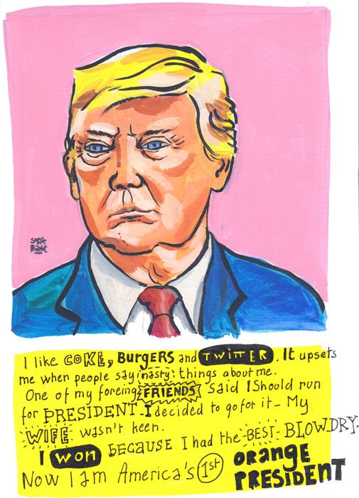
Roy Lichtenstein:

I found this artist when researching around, as soon as I set eyes on this mans work I was fascinated. I think it’s because in my earlier years we studied pop art and I found it really fun to create.

When looking deeper into this artist I found he didn’t mainly just focus on interior in fact he did a range of different subjects in pop art form. I found his art striking so I researched more into his career, I found out he only really did his comic book art till the late 60’s and then turned his work into more classic paintings which were inspired by other artists during or before his time working.

Image result for roy lichtenstein interior

I found his work interesting, in the way he uses techniques such as the quick likes and the dots in the mirror to show shadows and the lighting on his art is just plain white, I found this fascinating because it’s out of the ordinary and it makes the image pop, it takes time for you eyes to adjust. I think his work was very clever, the objects he draws were very fitting towards his era and clever to communicate and connect to the viewers of his work.

His work is very warming and inviting, his bold colours make it easy to enjoy and his message is simple enough for any view to be fascinated by. His style of work is a prime example of expression and how colour and the way lighting is shown can effect a full piece of art.


Vanessa Bell.

This artist I came across is the very opposite of my previous artist, her work is realistic and reflects the time of her paintings, her still life paintings are fascinating in the way her work is so real and her paint work is gentle.

As I looked further into the work of Vanessa I found she liked to capture people in the comfort of their living room, her work was based around the interior and heart of a person. To capture a person at their full comfort and to get a glimpse into the life of that person. I enjoyed and picked this artist because her work is just as amazing as my last artist apart from her movement and capture of work is different.

Image result for vanessa bell interior

In this picture above you can see that this artist has really captured this man in the comfort of his home and the detail to her image in amazing, this artist is more to terms with doing a full realistic painting. Her tone work isn’t mapped out like the last artist and she uses gradual different tones to change the lighting in the images.

This picture shows a different outlook on how interior can be presented, the is a more realistic take and there is far more detail involved than the last artist yet both are lovely piece’s of art. Their messages are different, but they both have the same subject just interpreted in different ways. I think her work really reflects of life for people back in this era and how the interior was shown and how people would present and use their living rooms back in this time.


All in all both artists have the same subject yet have different ways of showing their style of art. The image by Roy is much more fun and non realistic, done in the style of pop art, on the other hand Vanessa controls her work with realism and connects to her work with detail. Both artists have the same angle affect such as viewing it as person, straight on and how they view it; like I have been doing in my exercises. I found this research interesting in how artists reflect and do their outlooks on the subject of interior and the different way art has an effect on people.

Composition- an interior.

For this exercise we were asked to pick one of the rooms from our previous exercise and enhance and look more in detail of the layout and objects in the room. We were told to use a soft material to do quick sketches and find an angle we were comfortable with recreating.

I chose to do this exercise using a soft pencil as I found it was the material I am most used to using and am comfortable with showing tone with using this medium. I also chose to do this exercise with the living room, I chose this room due to it having good lighting during the day and I enjoyed recreating and drawing this room in the previous exercise. I chose to do all of these sketches landscape, I did this because all of the sketches I was doing fit better when landscape and I would fit more of what I envisioned on the page. Below is a picture of my results:


I think the sketches I have done for this exercise turned out well and the tones I have showed are an accurate representation of what I was seeing, I made quick visual notes and changed my view each time. I enjoyed doing this exercise the same as the last I liked being able to do quick sketches and not worry too much on the final look although I do think that the sketches turned out well and how I’d imagined. All in all I think this exercise was a success and I think I have built more of a skill when coming to identifying lighting and doing quick and detailed sketches.